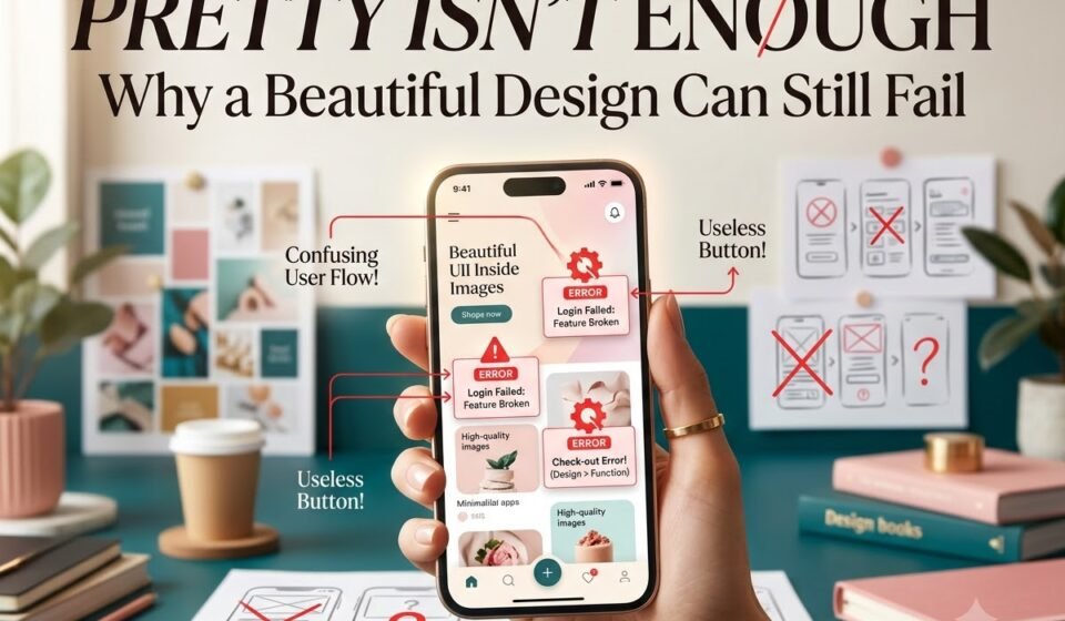

A design can look beautiful and still fail to communicate effectively.
It may have perfect colours, stylish fonts, and balanced layouts, but if viewers can’t understand the message or know what to do next, something is missing.
Good design isn’t just about aesthetics; it’s about effective communication.
A beautiful design attracts attention. An effective design makes that attention count.
Aesthetics vs. Effectiveness: What Is the Difference?
Aesthetics is about how a design looks and feels. It includes colours, typography, images, layout, shapes, visual style, and spacing.
These elements create a visual impression that can feel modern, elegant, playful, luxurious, bold, or minimal.
Effectiveness, on the other hand, is about how well a design achieves its purpose.
For example, an Instagram sale post should help the audience quickly understand:
a) What is being offered?
b) Who is offering it?
c) Why does it matter?
d) What should they do next?
A design can be visually appealing yet fail to communicate its message effectively.
That’s the difference between a design that looks good and one that works.
1. A Beautiful Design Can Have Poor Visual Hierarchy.
Imagine opening a poster and seeing five different elements competing for your attention.
The headline is large.
The product image is large.
The discount percentage is large.
The brand name is bold.
The call-to-action button is bright.
Everything is trying to be the most important thing.
The result?
Nothing feels important.
Visual hierarchy tells the viewer where to look first, second, and third. A good design creates a natural path for the eyes.
For example: 50% OFF → Product/Offer → Shop Now
The viewer should not have to search for the main message.
Use size, contrast, position, spacing, and typography to create this hierarchy.
So, before asking, “Does this look attractive?”, ask: “What will people notice first?”
If the answer is unclear, the design needs work.
2. Too Many Design Elements Can Create Confusion.
One of the easiest ways to make a design look worse is to keep adding things.
Designers often think a space needs something: a shape, icon, image, pattern, shadow, text, or decorative element.
But space is not wasted space.
White space gives important elements room to breathe. It separates information and makes the overall composition easier to understand.
Think about a website homepage.
If it contains multiple banners, pop-ups, buttons, colours, animations, headings, and images everywhere, it may look energetic, but the user may not know where to go.
A simpler design can sometimes communicate much more effectively.
Good design is not about adding more. Sometimes, it is about knowing what to remove.
3. Attractive Typography Can Still Be Difficult to Read.
A stylish font may look amazing in a design portfolio.
But that does not automatically make it a good choice.
Some decorative fonts are hard to read, especially in long paragraphs, small text, or important information.
Typography should do more than look attractive; it should communicate the message effectively.
When choosing a font, consider:
a) Is it readable?
b) Does it match the brand personality?
c) Does it work at different sizes?
d) Does it work well with the other fonts?
e) Does it have enough contrast with the background?
A beautiful font is ineffective if it makes the message difficult to read. The most effective font isn’t always the most visually exciting; it’s the one that communicates the message clearly.
4. Colour Can Attract Attention and Also Distract It.
Colour is powerful. A bright colour can immediately grab attention, but when everything is bright, nothing stands out.
Use a focused colour palette with a main colour, a supporting colour, and a neutral background. Reserve contrasting colours for important elements, such as CTAs.
The goal isn’t to use more colours; it’s to use them intentionally.
5. A Design Can Look Premium but Communicate the Wrong Message.
Imagine a budget-friendly clothing brand using a very luxurious black-and-gold visual style.
The design might look sophisticated and premium.
But if the brand's actual positioning is affordable and youthful, the visual identity may create the wrong expectation.
This is where design strategy becomes important.
Design should match the:
Brand → Audience → Message → Purpose
Colour is powerful. It can attract attention, create hierarchy, and shape how a brand feels.
But when every colour competes for attention, a design can quickly become chaotic. Instead of using too many colours, choose each one with a purpose: a main colour, a supporting colour, a neutral background, and a contrasting colour for important elements such as a CTA.
The right colour palette depends on the audience and the message. A children’s brand, fitness brand, and luxury jewellery brand may all require very different visual styles.
The goal isn’t to use more colours. It’s to use the right colours intentionally.
The better question is: “Is this visual style right for this audience and message?”
6. The Design Might Be Beautiful but Have No Clear Call to Action.
Suppose you create an attractive Instagram advertisement.
The photography is excellent.
The typography is beautiful.
The colours are perfectly balanced.
But at the end, the viewer has no idea what to do.
Should they visit the website?
Send a message?
Book an appointment?
Buy the product?
Follow the account?
A design created for marketing usually needs a clear next step.
That next step could be:
a) Shop Now
b) Book Your Appointment
c) Download Now
d) Learn More
e) Send Us a Message
Without a clear CTA, a design may grab attention but fail to turn that attention into action.
7. Designing for Yourself Can Be a Mistake.
This is probably one of the biggest traps for designers.
You may love minimal designs.
Your audience may prefer bold colours.
You may love experimental typography.
Your audience may need simple, readable information.
You may think a particular layout looks sophisticated.
Your audience may find it confusing.
As a designer, your personal taste matters, but it should not control every design decision.
The audience comes first.
Before designing, understand:
a) Who is going to see this?
b) What do they need to know?
c) What might confuse them?
d) What action do we want them to take?
Design is communication, not decoration.
The 5-Second Test.
Here is a simple test you can use before publishing a design.
Show the design to someone for around five seconds.
Then hide it and ask: “What was this design about?”
If they can explain the main message, you are on the right track.
If they remember only the colour, image, or “cool font”, but cannot explain the message, the design may be attractive without being effective.
You can also ask:
a) What did you notice first?
b) What do you think the main message was?
c) Who do you think this is for?
d) What would you do next?
Their answers can reveal problems that you may not notice because you already know what the design is supposed to say.
Final Thought: Design Should Do More Than Look Good...
Beautiful design has value. Aesthetics can create emotion, attract attention, build a brand personality, and make a design memorable.
But beauty alone is not enough.
The strongest designs combine aesthetics with purpose.
They look good, but they also communicate clearly.
They attract attention, but they guide it.
They create interest, but they do not create confusion.
They are visually appealing, but they never forget the audience.
So, the next time you finish a design, don't immediately ask: “Does this look good?”
Ask something more important: “Does this work?”
Because a design that looks beautiful gets attention.
But a design that looks beautiful and communicates effectively gets results.