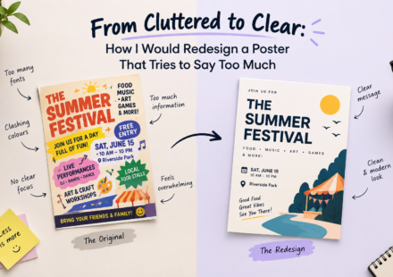
From Cluttered to Clear: How I Would Redesign a Poster That Tries to Say Too Much.

Introduction Have you ever looked at a poster and felt confused about where to look first? It may have attractive colours, stylish fonts, multiple images, decorative elements, and lots of information. Yet, after looking at it for a few seconds, you may…
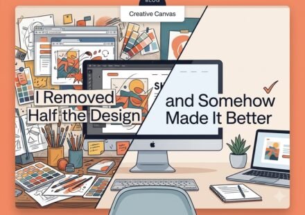
I Removed Half the Designand Somehow Made It Better
Sometimes, the biggest improvement you can make to a design is removing what doesn’t need to be there. As designers, we often feel the need to fill space with more icons, colours, fonts, or graphic elements. But good design isn’t about adding more. It’s…
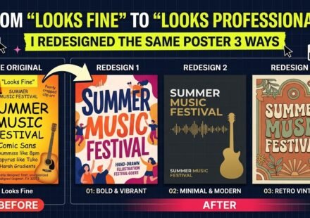
From “Looks Fine” to “Looks Professional”: I Redesigned the Same Poster 3 Ways
Have you ever looked at a design and thought, “It looks fine”? Nothing seems obviously wrong. The colours are decent, the text is readable, the images are okay, and all the information is there. But then you see a professionally designed poster and…
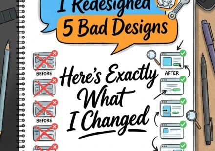
I Redesigned 5 Bad Designs, Here’s Exactly What I Changed.
Have you ever looked at a design and thought, “Something is not right,” but you could not explain what the problem was? The colours may look fine. The images may be good. The information may all be there. Still, the design feels messy, confusing, or…