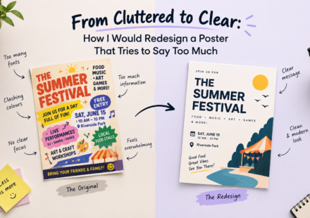
From Cluttered to Clear: How I Would Redesign a Poster That Tries to Say Too Much.

Introduction Have you ever looked at a poster and felt confused about where to look first? It may have attractive colours, stylish fonts, multiple images, decorative elements, and lots of information. Yet, after looking at it for a few seconds, you may…
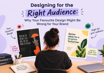
Designing for the Right Audience: Why Your Favourite Design Might Be Wrong for Your Brand
Have you ever created a design that you absolutely loved, only to realise that it did not connect with your audience? That happens more often than you might think. As designers, we naturally have personal preferences. We may love minimal layouts, bold…
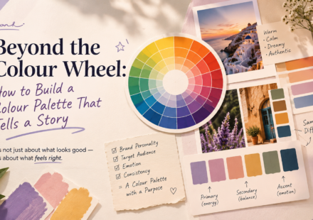
Beyond the Colour Wheel: How to Build a Colour Palette That Tells a Story
Colour is one of the first things people notice in a design. Before they read the headline, understand the message, or explore the layout, they already have an impression based on the colours they see. But good colour selection is not simply about…
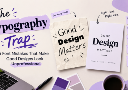
The Typography Trap: 5 Font Mistakes That Make Good Designs Look Unprofessional
A design can have beautiful colours, attractive images, and a creative layout, yet still look unprofessional. The reason? Poor typography. Typography is more than just choosing attractive fonts. It is about how text looks, feels, and communicates with…
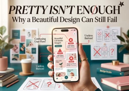
Pretty Isn’t Enough: Why a Beautiful Design Can Still Fail
A design can look beautiful and still fail to communicate effectively. It may have perfect colours, stylish fonts, and balanced layouts, but if viewers can’t understand the message or know what to do next, something is missing. Good design isn’t just…

How to Grow an Online Business: A Practical Guide for Beginners
Starting an online business is easier than ever, but growing it successfully requires more than just a website or an Instagram page. With increasing competition, businesses need a clear strategy, strong online visibility, consistent marketing, and a…
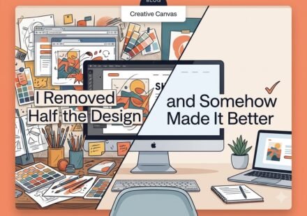
I Removed Half the Designand Somehow Made It Better
Sometimes, the biggest improvement you can make to a design is removing what doesn’t need to be there. As designers, we often feel the need to fill space with more icons, colours, fonts, or graphic elements. But good design isn’t about adding more. It’s…
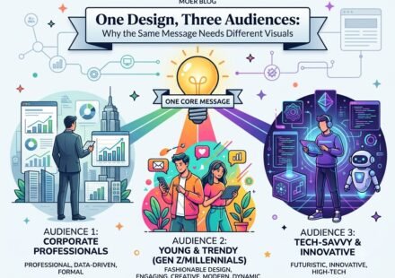
One Design, Three Audiences: Why the Same Message Needs Different Visuals
Imagine you have one simple message: “Start your journey to better fitness today.” The message is clear. But would you design it the same way for a college student, a corporate professional, and a luxury wellness client? Probably not. The words may stay…
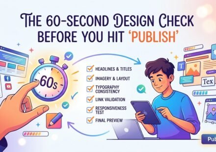
The 60-Second Design Check Before You Hit “Publish”
You’ve finished the design. The colours look right, the images are in place, the text is written, and you’re ready to publish. But wait. Before you click “Publish,” “Post,” or “Send,” give your design one final 60-second check. Why? Because a design…
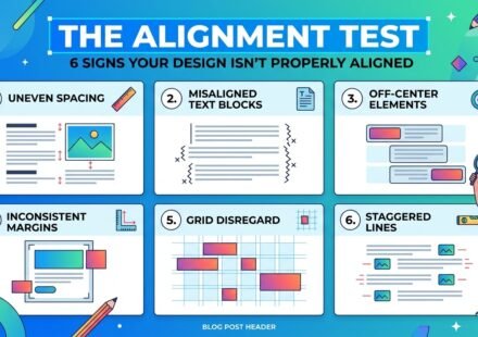
The Alignment Test: 6 Signs Your Design Isn’t Properly Aligned
Have you ever looked at a design and thought, “Something feels wrong”, but you couldn’t figure out exactly what? The colours look good. The fonts seem fine. The images are attractive. The content is correct. Yet, the overall design somehow looks…