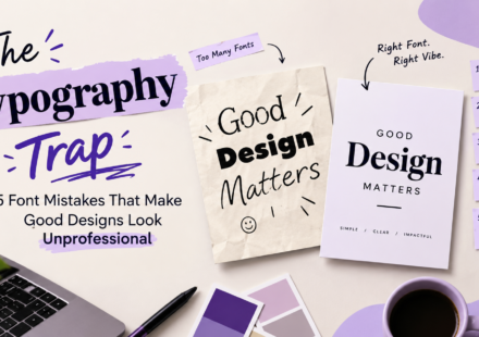
The Typography Trap: 5 Font Mistakes That Make Good Designs Look Unprofessional

A design can have beautiful colours, attractive images, and a creative layout, yet still look unprofessional. The reason? Poor typography. Typography is more than just choosing attractive fonts. It is about how text looks, feels, and communicates with…
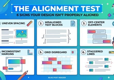
The Alignment Test: 6 Signs Your Design Isn’t Properly Aligned
Have you ever looked at a design and thought, “Something feels wrong”, but you couldn’t figure out exactly what? The colours look good. The fonts seem fine. The images are attractive. The content is correct. Yet, the overall design somehow looks…
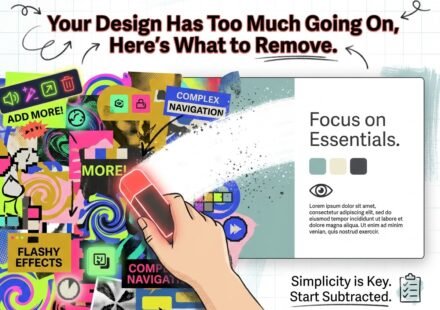
Your Design Has Too Much Going On, Here’s What to Remove.
Have you ever created a design and felt that something was wrong, but you could not figure out exactly what? You have a nice background, attractive fonts, good colours, images, icons, shapes and maybe even some effects. Individually, everything looks…
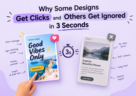
Why Some Designs Get Clicks and Others Get Ignored in 3 Seconds.
Have you noticed how some Instagram posts, ads, thumbnails, and banners instantly grab your attention, while others are easily ignored? You may think the difference is simply having a beautiful design, but that’s not always the case. Attractive colours,…