
Have you ever created a design and felt that something was wrong, but you could not figure out exactly what?
You have a nice background, attractive fonts, good colours, images, icons, shapes and maybe even some effects. Individually, everything looks fine. But when you see the complete design, it feels crowded.
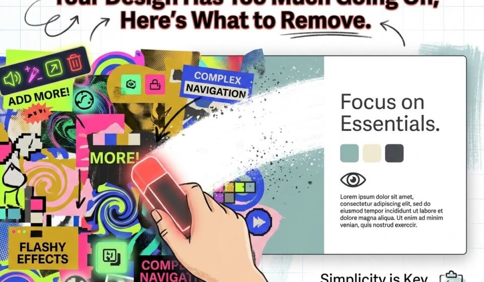
The problem may not be that your design needs something more.
It may need something less.
One of the most common mistakes in graphic design is trying to fill every space. Designers, especially beginners, often feel that a blank area means something is missing. So they add another shape, another icon, another line or another colour.
This creates visual noise.
A clean design does not mean a boring design. It means that every element has a reason to be there.
So, before adding anything to your next design, ask yourself: “What can I remove?”
1. Start With Your Main Message.
The first thing to remove is anything that distracts from the main message.
Every design should have a primary purpose. It could be promoting a product, announcing an event, sharing information or encouraging someone to take an action.
For example, imagine a poster saying: “Flat 50% Off on All Shoes”.
If the design contains a large shoe image, three decorative shapes, multiple icons, a pattern, five different text styles, a long paragraph and several bright colours, the viewer may not know where to look first.
The discount should probably be the main focus.
Ask yourself:
1. What should people notice first?
2. What should they notice second?
3. What information is actually necessary?
4. Does every element support the main message?
If an element does not help communicate the message, question whether it needs to stay.
2. Remove Unnecessary Text.
One of the easiest ways to make a design cleaner is to reduce the amount of text.
This does not mean removing important information. It means removing words that are not doing any useful work.
For example: “We are extremely excited and happy to announce that we are offering a special discount exclusively for all our valuable customers.” can become: “Special Discount for Our Customers”.
The second version is easier to read and takes less space.
People usually do not read every word on a graphic, especially on social media. They scan it.
So instead of asking, “What else can I write?”, ask: “What is the shortest way to communicate this?”
Shorter copy also gives your typography more room to breathe.
3. Stop Using Too Many Fonts.
Using multiple fonts does not automatically make a design interesting.
In fact, too many fonts can make it look confused and unprofessional.
If your heading uses one font, subheading another, body text another, and every small detail has a different font, there is no clear visual system.
A safer approach is to use one or two typefaces and create contrast through:
1. Font size.
2. Font weight.
3. Letter spacing.
4. Line spacing.
5. Uppercase or lowercase.
6. Position.
For example:
Heading — Bold
Subheading — Medium
Body — Regular.
You do not need five different fonts to create hierarchy.
Sometimes, one well-chosen typeface with different weights is enough.
4. Remove Decorative Elements That Have No Purpose.
Lines, circles, arrows, stickers, stars, blobs and icons can make a design attractive.
But they can also become clutter.
A decorative element should support the composition, create emphasis or guide the viewer's attention.
If it is simply there because the design feels, reconsider it.
Try temporarily removing all decorative elements from your design.
Look at it again.
If the design becomes clearer, you have found your problem.
Then add back only the elements that genuinely improve it.
This is an important design habit: Do not decorate space just because it is .
5. Reduce Colour Overload.
Colour is powerful, but using too many colours can make a design visually noisy.
Imagine a design using bright pink, yellow, green, blue, purple, orange and red. Even if every colour looks good individually, together they may compete for attention.
Instead, create a simple colour system.
You could have:
1. One primary colour.
2. One secondary colour.
3. One accent colour.
4. Neutral colours such as white, black or grey.
You can still create an attractive design without making every element a different colour.
The goal is not to use fewer colours just for the sake of it.
The goal is to make sure colour has a job.
Use it to create hierarchy, highlight important information or strengthen the brand, not simply to fill space.
6. Give Your Design More Breathing Room.
White space is not wasted space.
It is one of the most useful tools in graphic design.
When elements are packed closely together, the design becomes difficult to scan. When there is enough space between elements, the viewer can understand the information more easily.
Look at your:
1. Margins.
2. Padding.
3. Line spacing.
4. Space between headings and paragraphs.
5. Space between images and text.
6. Space between different sections.
Do not try to make everything as large as possible.
Sometimes reducing the size of an element and giving it more surrounding space makes it look more important.
That may sound strange, but it works.
Space creates emphasis.
7. Remove Repeated Information.
Another common problem is saying the same thing more than once.
For example, a poster might have:
SALE
BIG SALE
50% OFF SALE
LIMITED-TIME SALE
If all of these are communicating the same message, you do not need all four.
Choose the strongest version.
The same applies to logos, buttons, icons, headings and supporting text. Repetition can weaken hierarchy instead of strengthening it.
Ask: “Does this element provide new information?”
If the answer is no, remove it or combine it with something else.
8. Do Not Add Effects Just Because You Can.
Shadows, gradients, outlines, glows, textures and 3D effects can look impressive.
But effects should support the design, not become the design.
A common beginner mistake is adding effects to make a simple design feel more “professional”.
Usually, the opposite happens.
If your typography, spacing, alignment and hierarchy are weak, effects will not fix the design. They will only make the problems harder to see.
Before adding an effect, ask yourself: “What problem is this effect solving?”
If you don’t have a clear answer, you probably don’t need it.
9. Use the Squint Test.
Here is a simple way to check whether your design has too much going on.
Look at your design and slightly squint your eyes.
You should still be able to identify the main visual focus.
If everything appears equally strong, your hierarchy may be weak.
You can also zoom out or look at the design from a distance.
Ask yourself: What do I notice first?
Then ask: Is that what I wanted people to notice first?
If not, something needs to change.
10. Clean Does Not Mean Boring.
This is where many people misunderstand minimal design.
A clean design is not simply a design with a white background and very little content.
A clean design can be bold, colourful, dramatic and visually interesting.
The difference is control.
You can use a large headline, strong colour, an unusual image or an interesting composition. But when everything is shouting for attention, nothing feels important.
Think of your design like a conversation.
If five people are speaking at the same time, you will struggle to understand anyone.
Good design gives each element its turn.
A Simple Remove Before You Add Checklist.
Before publishing your next design, ask:
1. Is every element necessary?
2. Can I remove any words without losing the meaning?
3. Am I using too many fonts?
4. Are too many colours competing for attention?
5. Do the decorative elements have a purpose?
6. Is there enough white space?
7. Is anything repeated unnecessarily?
8. Are effects helping or distracting?
9. Can I immediately identify the main message?
10. Does the design still work after removing a few elements?
If removing something makes the design clearer, do not add it back simply because you like how it looks.
Final Thought...
Good graphic design is not about adding more and more elements until the canvas looks full.
It is about making decisions.
Every font, image, colour, shape, line and word should have a purpose. When unnecessary elements are removed, the important elements get more attention.
So the next time your design feels incomplete, do not immediately open the Elements tab and start adding things.
Pause.
Look at your design.
Remove something.
Then look again.
You may find that the design did not need more.
It needed less.