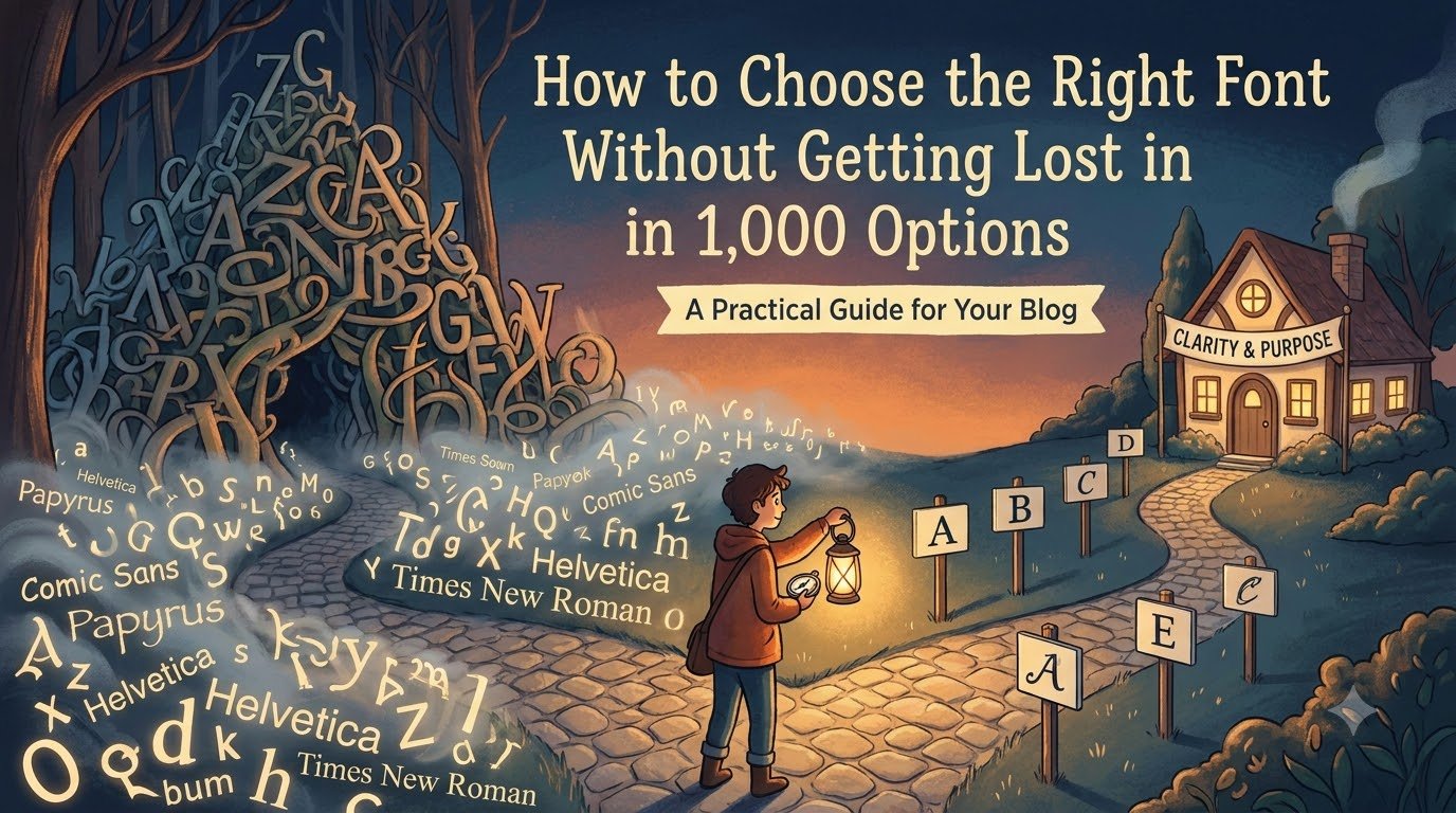

Open Canva, Figma, Photoshop, or any other design tool and search for fonts. Suddenly, you have hundreds of options:
Bold. Elegant. Minimal. Handwritten. Retro. Modern.
After scrolling for 20 minutes, you’re still wondering: “Which one should I choose?”
The problem isn’t that there are too many fonts. It’s that we often choose fonts based only on how they look.
A good font should match the brand personality, audience, readability, and purpose of the design.
Instead of randomly testing fonts, use this simple framework.
1. Start With the Brand Personality.
Before choosing a font, ask: “If this brand were a person, what would its personality be?”
Is it professional, fun, elegant, friendly, bold, traditional, or youthful? Your font should reflect that personality.
For example, a playful cartoon font may feel completely wrong for a luxury jewellery brand, while a refined serif can instantly communicate sophistication.
A simple guide:
1. Professional: Clean sans-serif or classic serif.
2. Luxury: Elegant or high-contrast serif.
3. Modern: Geometric or clean sans-serif.
4. Friendly: Rounded, approachable fonts.
5. Creative: Distinctive display fonts.
6. Traditional: Classic serif fonts.
7. Youthful: Bold, expressive, or playful fonts.
There is no universally “best” font, only a font that is right or wrong for the context.
2. Know Your Audience.
A font that works for teenagers may not work for a law firm. A font perfect for a children’s brand may look completely wrong on a financial website.
That’s why your audience matters.
Ask yourself: Who will actually read this design?
Consider their age, expectations, interests, and where they’ll see your content.
For example, a social media post aimed at young audiences can use more personality and experimentation. A corporate presentation usually needs a font that feels professional and restrained.
The goal isn’t to choose a font your audience likes. It’s to choose one that helps them understand and trust your message.
3. Consider the Purpose of the Design.
Your font choice should change depending on what you are designing.
A font for a logo does not have to work exactly like a font for a 500-word article.
Different purposes have different requirements.
a) For Logos
The font needs to be distinctive, memorable, and aligned with the brand identity.
b) For Social Media Posts
You can use stronger, more expressive fonts because the design needs to grab attention quickly.
c) For Websites
Readability becomes much more important. People should be able to read paragraphs comfortably on different screen sizes.
d) For Presentations
Choose fonts that remain clear from a distance. Overly decorative fonts can become difficult to read.
e) For Posters and Advertisements
Display fonts can work well for headlines, but the supporting information should remain easy to scan.
A common mistake is using the same type of font for every situation simply because it looks good.
Design is not about finding a beautiful font. It is about finding the right font for the job.
4. Never Sacrifice Readability for Style.
This is where many designs go wrong.
A font may look beautiful when you type one word in large letters. But what happens when you use it for an entire paragraph?
Suddenly, reading becomes tiring.
Before finalizing a font, test it with actual content, not just “Hello” or “Creative Design”.
Write a realistic headline, paragraph, button, or caption and see how it performs.
Check:
1. Can you read it quickly?
2. Are the letters clearly distinguishable?
3. Does the spacing feel comfortable?
4. Does it remain readable at smaller sizes?
5. Does it work on mobile screens?
6. Is there enough contrast between the text and background?
Remember: If people notice the font before they understand the message, the font may be doing too much.
5. Don't Choose 10 Fonts, Start With 2.
You don't need five different fonts to create an interesting design.
In fact, using too many fonts often makes a design look messy and inconsistent.
A safer starting point is: One font for headings + one font for body text.
For example, you could use a bold sans-serif for headings and a simple sans-serif for paragraphs.
Or you could combine a serif heading font with a clean sans-serif body font.
The important thing is contrast.
Your heading and body fonts should feel different enough to create hierarchy but similar enough to feel like they belong to the same design.
If you're a beginner, start with two fonts maximum.
Once you understand typography better, you can experiment with more complex combinations.
6. Use Font Weight Before Adding Another Font.
Here's a useful trick: you don't always need another font to create variety.
Many font families already provide multiple weights such as:
Light → Regular → Medium → Semibold → Bold.
You can use the same family with different weights to create hierarchy.
For example:
Main Heading — Bold
Subheading — Semibold
Body Text — Regular
Small Information — Medium
This creates structure without making the design visually chaotic.
Sometimes, the problem isn't that your design needs another font.
It needs better hierarchy.
7. Check the Font in the Real Design.
Never judge a font only from the font menu.
A font can look fantastic in isolation and completely wrong once it is placed inside your design.
Test it with:
1. Your brand colours.
2. Your actual logo
3. Your images
4. Your headline
5. Your body copy
6. Your buttons or calls to action
7. Your intended layout
Look at the complete composition.
Typography doesn't exist separately from the rest of the design. It interacts with colour, spacing, images, shapes, and layout.
8. Create a Shortlist Instead of Endless Scrolling.
Here's a simple way to stop wasting time.
Instead of trying 50 fonts, shortlist three.
For each font, ask:
Does it match the brand personality?
Is it readable?
Does it suit the audience?
Does it work for the purpose?
Does it look good with the rest of the design?
If a font fails even two or three of these questions, remove it.
You don't need to find the “perfect” font.
You need to eliminate the wrong ones until the right choice becomes obvious.
The 5 Question Font Framework.
Next time you are stuck between hundreds of fonts, don't scroll endlessly.
Ask these five questions:
1. Personality
Does this font feel like the brand?
2. Audience
Will the target audience connect with it and understand it easily?
3. Purpose
Is it suitable for what I'm designing?
4. Readability
Can people read the message quickly and comfortably?
5. Consistency
Does it work with the colours, images, layout, and other typography?
If the answer is yes to all five, you probably have a strong choice.
Final Thought...
Choosing a font isn't a competition to find the most beautiful typeface.
It is a communication decision.
The right font should support the message rather than compete with it.
It should give the brand the right personality, make the content easier to understand, and guide the viewer through the design.
So the next time you open a font library and see 1,000 options, don't ask: “Which font looks the coolest?”
Ask: “Which font does this design actually need?”
That one question will eliminate a lot of unnecessary scrolling and make your design decisions much more intentional.