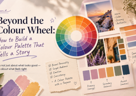
Beyond the Colour Wheel: How to Build a Colour Palette That Tells a Story

Colour is one of the first things people notice in a design. Before they read the headline, understand the message, or explore the layout, they already have an impression based on the colours they see. But good colour selection is not simply about…
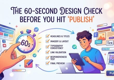
The 60-Second Design Check Before You Hit “Publish”
You’ve finished the design. The colours look right, the images are in place, the text is written, and you’re ready to publish. But wait. Before you click “Publish,” “Post,” or “Send,” give your design one final 60-second check. Why? Because a design…
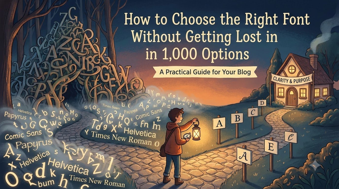
How to Choose the Right Font Without Getting Lost in 1,000 Options.
Open Canva, Figma, Photoshop, or any other design tool and search for fonts. Suddenly, you have hundreds of options: Bold. Elegant. Minimal. Handwritten. Retro. Modern. After scrolling for 20 minutes, you’re still wondering: “Which one should I choose?”…
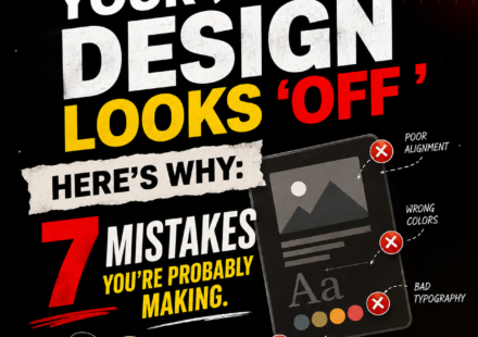
Your Design Looks ‘Off’— Here’s Why The 7 Mistakes You’re Probably Making
7 Graphic Design Mistakes Making Your Designs Look Unprofessional. Have you ever created a design that looks fine at first, but something still doesn’t feel right? You have chosen a good colour palette, added attractive images, selected a nice font, and…