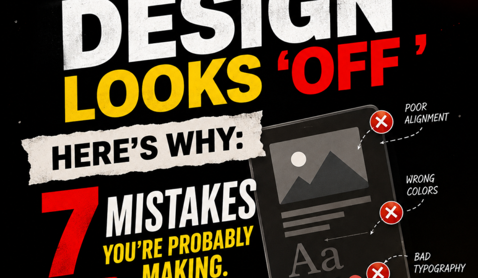

Have you ever created a design that looks fine at first, but something still doesn’t feel right?
You have chosen a good colour palette, added attractive images, selected a nice font, and included all the important information. Still, the final design does not look as professional as the designs created by experienced designers.
The problem may not be your design software or your lack of creativity. In many cases, it is the minor design mistakes that make a layout feel unbalanced, confusing, or incomplete.
Good graphic design is not only about making something beautiful. It is about making information easy to understand while keeping the design visually attractive.
Here are seven common mistakes that could be making your design look “off” and what you can do to fix them.
1. Poor Spacing
One of the most common mistakes in graphic design is poor spacing.
Many beginners feel that space means wasted space, so they try to fill every corner of the design with text, images, icons, or shapes. But this usually makes the design look crowded.
Spacing gives your design room to breathe. It helps separate different sections and allows the viewer to understand which elements belong together.
For example, if a heading, paragraph, button, and image are placed very close to each other, the viewer may not know where one section ends and another begins.
How to fix it:
1. Give enough space around headings and paragraphs.
2. Keep similar gaps between related elements.
3. Use larger spacing between separate sections.
4. Avoid placing text too close to the edges.
5. Maintain consistent padding inside boxes and buttons.
Remember: Empty Space is not wasted space. It is part of the design.
2. Weak Visual Hierarchy
Imagine opening a poster and seeing five different elements competing for your attention. The headline is the same size as the description, the logo is huge, and the generous offer is hidden somewhere at the bottom.
That is a hierarchy problem.
Visual hierarchy tells the viewer what they should notice first, second, and third. Without it, even a beautiful design can become confusing.
Your main headline should usually attract attention first. Supporting information should come next, followed by secondary details.
You can create hierarchy using:
1. Font size
2. Font weight
3. Colour
4. Position
5. Contrast
6. Spacing
7. Scale
For example, if you are designing an Instagram post for a sale, “50% OFF” should probably get more attention than the small terms and conditions.
How to fix it:
Ask yourself one simple question: “What should people see first?”
Then make that element visually stronger.
After that, decide what they should notice next.
If everything is important, nothing is important.
3. Bad Typography
Typography can significantly influence the overall look and feel of a design.
One of the most common mistakes beginners make is using too many fonts in an attempt to make their designs appear more creative.
However, this often has the opposite effect.
Using multiple fonts can make a simple design look cluttered, inconsistent, and unprofessional.
Another common issue is choosing fonts that do not suit the purpose or tone of the design.
For example, a playful font may work well for a children’s event but may not be appropriate for a corporate presentation.
Readability is equally important. If people have to struggle to read your text, the design has failed to communicate its message effectively.
How to fix it:
Try using two fonts, or even a single font with different weights.
For example: Heading - Bold
Subheading - Medium
Body - Regular.
Also, pay attention to line spacing, letter spacing, font size, and text width.
Do not choose a font simply because it looks attractive.
Choose one that suits the purpose of the design, communicates the right tone, and remains easy to read.
4. Inconsistent Alignment
Alignment is one of those things people may not consciously notice, but they definitely notice when it is wrong.
Imagine a poster where one heading starts 20 pixels from the left edge, another starts 35 pixels away, and the paragraph starts somewhere in between. The design may feel messy even if you cannot immediately explain why.
Alignment creates order.
Most professional designs use invisible guides or grids to keep elements properly aligned.
How to fix it:
Choose an alignment system and stick to it.
For example, you can use:
1. Left alignment for text-heavy designs.
2. Centre alignment for certain promotional or minimal designs.
3. A grid system for complex layouts.
Make sure headings, paragraphs, images, buttons, and other elements line up intentionally.
Do not move an element just because it “looks better” in isolation. Check how it works with the rest of the layout.
5. Overcrowding
More content does not automatically mean more value.
One of the biggest mistakes in social media designs, posters, and advertisements is trying to include everything in a single graphic.
The designer may think, “The customer needs to know all this information,” so they add more text, more icons, more images, more shapes, and more colours.
The viewer does not know where to look.
A design should communicate the most important message quickly.
How to fix it:
Remove anything that does not support the main message.
Ask: “Does this element need to be here?”
If removing it does not affect the message, remove it.
For social media especially, keep the main graphic simple and use the caption for additional information when appropriate.
6. Using Too Many Colours
Colour can make a design attractive, but using too many colours can make it look chaotic.
A common mistake is choosing several colours simply because they look good individually.
The problem appears when you place them together.
A strong colour palette usually has a clear purpose.
You may have a primary colour, secondary colour, and an accent colour.
For example, a brand might use one main colour for backgrounds or important elements, another colour for supporting information, and a contrasting accent colour for buttons or calls to action.
How to fix it:
Start with a simple palette.
Choose one dominant colour, one or two supporting colours, and a neutral colour such as white, black, or grey.
Also make sure there is enough contrast between your text and background.
Good colour selection is not about using more colours.
It is about using the right colours in the right places.
7. Copying Trends Instead of Building a Purposeful Design
Trends are useful for inspiration, but blindly following them can make your design look generic.
For example, a certain typography style, gradient, grain effect, or 3D element may be popular on Instagram today.
That does not mean it belongs in every design.
Design should always start with the purpose, audience, and message.
A restaurant poster, a financial company's advertisement, and a fashion brand's Instagram post should not all look the same simply because a particular design trend is popular.
How to fix it:
Before opening Canva, Photoshop, or Illustrator, answer three questions:
1. Who is this design for?
2. What do I want them to understand?
3. What action should they take?
Once you know the answers, choose colours, fonts, images, and layouts accordingly.
Final Thoughts...
A design does not become professional just because you add more effects, better images, or trendy fonts.
Often, professional design comes from doing less, but doing it properly.
Fix your spacing. Create a clear visual hierarchy.
Use typography carefully. Align your elements.
Remove unnecessary content. Control your colours.
Most importantly, design with a purpose instead of simply decorating the page.
The next time your design feels “off,” do not immediately start changing random elements.
Take a step back and check these seven areas.
Sometimes, the difference between an average design and a professional one is not a new idea.
It is simply better design decisions.