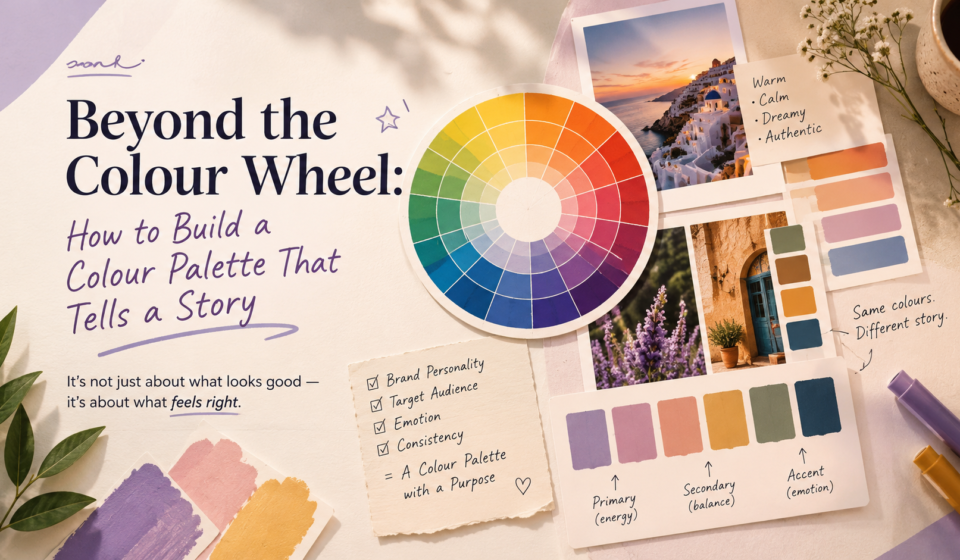

Colour is one of the first things people notice in a design. Before they read the headline, understand the message, or explore the layout, they already have an impression based on the colours they see.
But good colour selection is not simply about choosing shades that look attractive together. A strong colour palette has a purpose. It communicates personality, creates emotion, guides attention, and helps a brand become recognizable.
This is where designers need to move beyond the colour wheel. Instead of asking, “Which colours look good together?” ask, “What should these colours make people feel, understand, and remember?”
Attractive Colours vs Strategic Colours
Choosing attractive colours often comes down to personal preference. However, what looks beautiful to you may not communicate the right message or align with a brand’s identity.
Strategic colour selection starts with the brand's purpose, personality, audience, and message.
For example, imagine a financial consulting company using neon pink, bright yellow, and lime green simply because the combination looks energetic. The colours may be attractive, but they may not immediately communicate trust, stability, or professionalism.
On the other hand, a children's activity brand could benefit from brighter, playful colours because its audience expects energy and fun.
Strategic colours answer three questions:
1. What does the brand want to communicate?
2. Who is the brand communicating with?
3. What emotional response should the audience have?
A colour palette should therefore support the brand's story instead of becoming the story itself.
Understanding Primary, Secondary and Accent Colours.
A well-planned palette usually has different colour roles. You do not need to use every colour equally.
1. Primary Colour
The primary colour is the main colour associated with the brand. It often appears in important brand elements such as logos, headers, packaging, website sections, or major backgrounds.
For example, a wellness brand might use soft green as its primary colour to convey nature, health, and calm.
The primary colour should be distinctive enough to create recognition but practical enough to work across different applications.
2. Secondary Colour
Secondary colours support the primary colour and provide variety.
A brand may use two or three secondary colours for illustrations, backgrounds, cards, social media graphics, or supporting elements.
They should complement the primary colour rather than compete with it.
3. Accent Colour
The accent colour attracts attention.
Think of it as the visual equivalent of highlighting an important sentence. It can be used for buttons, calls to action, important icons, offers, links, or specific design details.
Many designers make the mistake of overusing accent colours. When everything stands out, nothing feels important.
A simple rule to follow: use primary colours to build brand identity, secondary colours to add variety, and accent colours to guide attention.
Complementary, Analogous and Monochromatic Palettes.
Understanding colour relationships makes palette creation much easier.
a) Complementary Palette
Complementary colours sit opposite each other on the colour wheel.
Examples include blue and orange or purple and yellow.
These combinations create strong contrast and visual energy. They can work well for brands that want to appear bold, youthful, energetic, or attention-grabbing.
However, using both colours at full intensity can become overwhelming. Usually, one colour should dominate while the other works as an accent.
b) Analogous Palette
Analogous colours sit next to each other on the colour wheel.
For example, blue, blue-green, and green form an analogous palette.
These combinations generally feel harmonious and comfortable because the colours have a natural visual relationship.
They are ideal for brands that aim to convey calmness, consistency, a connection with nature, or sophistication.
c) Monochromatic Palette
A monochromatic palette uses different shades, tints, and tones of a single colour. For example, a blue palette may include pale blue, medium blue, deep navy, and muted blue-grey.
This approach creates a clean, cohesive, and balanced look, making it ideal for minimalist brands, professional websites, and presentations. However, without enough contrast in brightness, saturation, or texture, a monochromatic palette can appear visually flat.
Build the Palette Around the Brand Personality.
Before selecting colours, define the personality of the brand.
Is it:
1. Professional or playful?
2. Premium or affordable?
3. Traditional or modern?
4. Calm or energetic?
5. Minimal or expressive?
6. Serious or friendly?
Imagine a luxury skincare brand and a budget-friendly children's stationery brand. Both may sell consumer products, but their colour strategies should probably be very different.
A luxury skincare brand could use muted beige, cream, deep brown, and a subtle gold accent. The result can feel refined and premium.
A children's stationery brand could use bright yellow, coral, blue, and green to create an energetic and playful impression.
The target audience matters just as much.
A palette designed for teenagers may use stronger contrasts and trend-driven colours, while a palette for a professional financial audience may benefit from more restrained colours.
This does not mean designers should blindly follow stereotypes. Colour preferences vary across cultures, industries, age groups, and individuals. The important point is to understand the audience instead of designing only according to personal taste.
Practical Walkthrough: Three Palettes for One Brand.
Let's take one fictional brand: "NaturaGlow", a skincare brand focused on natural ingredients.
The brand stays the same, but its visual personality can change dramatically depending on the colour strategy.
Palette 1: Natural and Calm
For a brand that wants to emphasise natural ingredients and relaxation:
This analogous-inspired palette combines warm, earthy tones to create a calm and natural feel. Sage green brings freshness and a connection to nature, while cream and beige add softness. Terracotta introduces warmth, keeping the palette balanced and visually interesting.
This combination works well for skincare brands targeting customers who appreciate a calm, natural, and minimal aesthetic.
Palette 2: Premium and Sophisticated
Now imagine "NaturaGlow" wants to position itself as a luxury skincare brand.
The palette could become:
The deeper colours immediately create a more premium and sophisticated feeling.
Here, gold should be used carefully. If it appears everywhere, the design can quickly look excessive. Used selectively on packaging details, headings, borders, or icons, it can create a sense of luxury.
The same skincare brand now tells a completely different story.
Palette 3: Fresh and Youthful
Suppose NaturaGlow wants to target younger customers and create a more energetic identity.
The palette could be:
This combination creates more energy and contrast.
Coral gives the brand personality, peach keeps the palette approachable, cream provides breathing space, and teal can be used for buttons, highlights, or important information.
The products have not changed. The brand has not changed. Only the visual language has changed.
That is the power of strategic colour selection.
Colour Should Have a Job.
One of the biggest design mistakes is choosing colours without assigning them a purpose.
Before finalising a palette, create a simple colour-role system:
a) Primary → Brand recognition
b) Secondary → Supporting information
c) Accent → Attention and action
d) Neutral → Balance and readability
This prevents the design from becoming a collection of random colours.
Also, test the palette in real situations. A colour combination that looks beautiful on a mood board may fail on a website, mobile screen, printed brochure, or social media post.
Check contrast, readability, accessibility, and how the colours work with photographs and typography.
Final Thoughts.
A colour palette is more than a collection of beautiful shades. It is a visual language.
Attractive colours may catch attention, but strategic colours give that attention direction. They help communicate personality, create emotional associations, guide the viewer's eye, and make a brand easier to recognize.
The colour wheel is a useful starting point, but it should not be the final decision-maker.
Start with the brand story, understand the audience, define the personality, and assign clear roles to each colour. Then use complementary, analogous, or monochromatic colour relationships to create a cohesive system. The best palette isn’t always the prettiest; it’s the one that communicates the brand effectively.
It is the one that tells the right story.