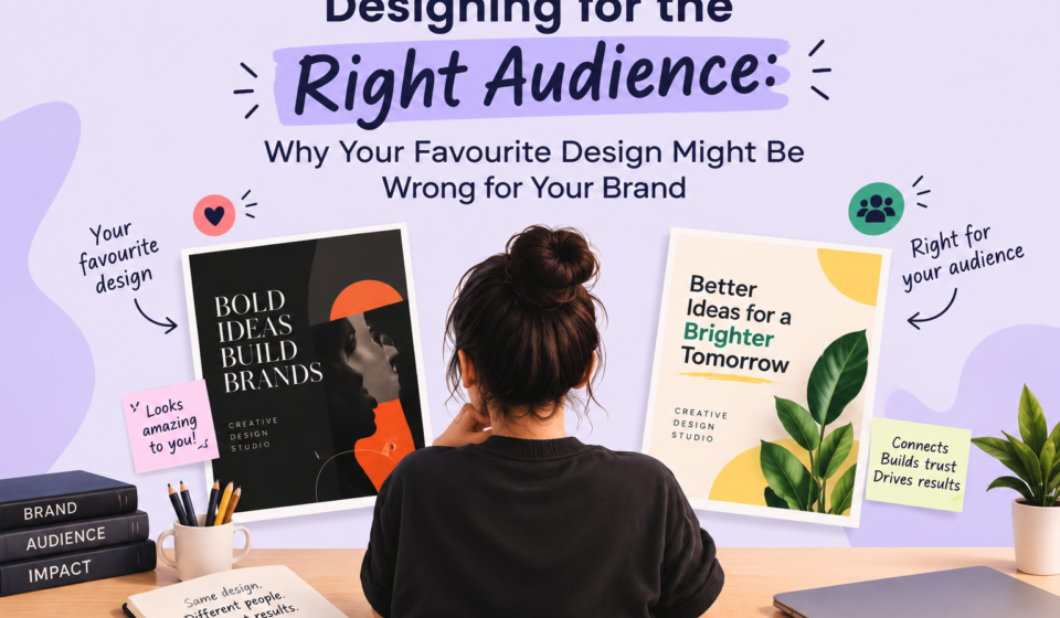
Designing for the Right Audience: Why Your Favourite Design Might Be Wrong for Your Brand

Have you ever created a design that you absolutely loved, only to realise that it did not connect with your audience?
That happens more often than you might think.
As designers, we naturally have personal preferences. We may love minimal layouts, bold colours, elegant typography, dramatic visuals, or trendy gradients. But a design is not successful simply because the designer likes it.
Good design is not about what you like. It is about what works for the people you are designing for.
A brand can have a beautiful visual identity and still struggle to attract customers if its design does not match its audience. Understanding who you are designing for is therefore just as important as understanding colour, typography, layout, and imagery.
Why Your Personal Preference Should Not Control Every Design Decision.
Your personal taste can be a useful starting point, but it should never become the final decision-maker.
Imagine you love dark, luxurious designs with serif fonts. That style may look sophisticated, but using it for a children's learning app could make the brand feel serious and intimidating. Similarly, a bright, playful design may look attractive to you but feel inappropriate for a premium jewellery brand.
This is where designers need to separate personal preference from design strategy.
Before choosing a colour or font, ask:
a) Who is going to see this design?
b) What do they expect from this brand?
c) What emotions should the design create?
d) What would make them trust the brand?
e) What visual style do competitors in this market use?
f) What action do we want the audience to take?
The best design is not necessarily the one you would choose for yourself. It is the one that communicates effectively with the intended audience.
How Your Audience Influences Visual Choices.
Different audiences respond to different visual signals. Age, interests, expectations, lifestyle, spending habits, and buying behaviour can all influence how a brand should look.
1. AGE
Age can influence preferences, but it should not be treated as a strict rule.
Younger audiences may respond well to bold typography, vibrant colours, motion, humour, memes, and visually dynamic content. Older audiences may prefer clearer layouts, readable typography, familiar visual cues, and straightforward communication.
However, demographics alone are not enough. A 22-year-old buying a luxury watch may respond very differently from a 22-year-old shopping for affordable streetwear.
2. INTERESTS AND LIFESTYLE
A brand targeting fitness enthusiasts may use energetic photography, strong typography, and active compositions. A wellness brand might use softer colours, natural imagery, and generous whitespace.
The visual language should reflect the lifestyle of the people the brand wants to attract.
3. EXPECTATIONS
People also have expectations based on the category.
When customers visit a financial services website, they expect professionalism, clarity, and trust. When they open a gaming website, they may expect energy, excitement, and immersive visuals.
If the design conflicts with these expectations, customers may become confused about what the brand represents.
4. BUYING BEHAVIOUR
Buying behaviour is particularly important.
A customer purchasing an expensive product may look for signals of quality, exclusivity, craftsmanship, and trust. Someone searching for a budget-friendly product may prioritize value, convenience, offers, and clear information.
Therefore, the same visual style cannot work equally well for every customer group.
How Different Brands Communicate Visually.
Let's compare three broad brand categories: luxury, budget-friendly, and youth-focused.
1. Luxury Brands
Luxury brands often communicate exclusivity, sophistication, quality, and restraint.
Their designs may use:
a) Minimal layouts
b) Elegant typography
c) Limited colour palettes
d) High-quality photography
e) Generous whitespace
f) Subtle branding
The goal is not to show everything at once. Instead, the design creates a feeling that the product is carefully selected and worth a premium price.
2. Budget-Friendly Brands
Budget-friendly brands generally need to communicate value, accessibility, convenience, and affordability.
Their designs may use:
a) Strong promotional messaging
b) High-contrast colours
c) Clear pricing
d) Product-focused imagery
e) Simple layouts
f) Visible offers and calls to action
The customer should quickly understand what the product is, how much it costs, and why it is worth buying.
3. Youth Focused Brands
Youth-focused brands often communicate energy, individuality, fun, relevance, and self-expression.
They may experiment with:
a) Bright or unexpected colours
b) Bold typography
c) Collage-style layouts
d) Illustrations
e) Motion graphics
f) Memes and cultural references
The important point is that being trendy is not enough. The visual style must still support the brand's personality and audience.
How to Research Your Target Audience Before Designing.
Design research does not need to be complicated. But skipping it is a mistake.
Before opening Canva, Figma, Illustrator, or Photoshop, take the time to understand your target audience.
1. Define the Target Customer
Start with basic information:
a) Age Range
b) Location
c) Profession
d) Income Level
e) Lifestyle
g) Interests
h) Problems
i) Buying habits
Do not stop at "women aged 18–35". That is too broad to guide a meaningful design.
Try to understand what those people actually want and why they buy.
2. Study Competitors
Look at brands targeting the same audience.
Analyse:
a) Colours
b) Typography
c) Photography
d) Layouts
e) Packaging
f) Social media content
g) Website design
h) Offers and messaging
You are not copying competitors. You are identifying the visual expectations of the market and finding opportunities to differentiate.
3. Look at Real Customer Behaviour
Reviews, comments, social media discussions, surveys, product ratings, and customer questions can reveal what people actually care about.
For example, if customers repeatedly complain about complicated pricing, a brand's design should make pricing much easier to understand.
4. Create a Moodboard
Collect visual references that reflect your target audience’s preferences and expectations.
Then ask: "Does this moodboard represent the customer, or does it simply represent my personal taste?"
That question can prevent many bad design decisions.
Case Study: Three Visual Directions for the Same Product.
Imagine a brand is launching the same product: a premium face serum.
The product itself does not change. The audience does.
Direction 1: Luxury Audience
The target customer is willing to spend more and expects premium quality.
The design uses:
a) Black, ivory, and muted gold
b) Elegant serif typography
c) Minimal product photography
d) Large whitespace
e) Short, sophisticated copy
The overall impression is premium and exclusive.
Direction 2: Budget-Conscious Audience
The target customer wants an effective serum at an affordable price.
The design uses:
a) Bright, approachable colours
b) Large product images
c) Clear price and discount information
d) Simple typography
e) Benefit-focused messaging
The design communicates value and accessibility.
Direction 3: Young, Trend-Focused Audience
The target customer is younger and highly influenced by social media and beauty trends.
The design uses:
a) Vibrant colours
b) Bold typography
c) Close-up skincare imagery
d) Playful graphic elements
e) Short, conversational copy
The visual identity feels fresh, energetic, and social-media friendly.
All three designs can be attractive. All three can be professionally designed. But they are not interchangeable.
A luxury customer may find the budget-focused design too promotional. A budget-conscious customer may find the luxury design unnecessarily expensive-looking. A younger customer may find the luxury version too formal.
The product stayed the same. The audience changed, so the design changed.
Design for the Audience, Not Your Portfolio.
One of the biggest mistakes designers can make is designing primarily to impress other designers.
Effective design goes beyond aesthetics. It helps the target audience understand the message, build trust, and connect with the brand.
Your portfolio should demonstrate your design ability, but client work should demonstrate your ability to solve communication problems.
Before finalizing a design, ask yourself: "If I were the target customer, would this make me stop, understand, trust, and take action?"
If the answer is no, your personal attachment to the design does not matter.
Final Thoughts.
Great design begins with empathy.
Your favourite colour may not be the right brand colour. Your favourite font may not be the right typeface. The design style you find beautiful may completely miss your target audience's expectations.
That is not a failure of creativity. It reminds us that design is a communication tool.
Don't design for the person holding the mouse. Design for the person on the other side of the screen.