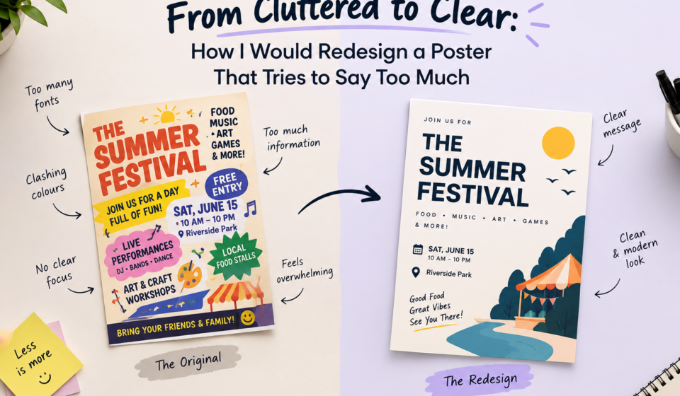

Introduction
Have you ever looked at a poster and felt confused about where to look first? It may have attractive colours, stylish fonts, multiple images, decorative elements, and lots of information. Yet, after looking at it for a few seconds, you may still struggle to understand its main message.
This is a common problem in graphic design. Many posters become cluttered because the designer tries to communicate everything in one place. The intention is to provide more information, but the result is often the opposite. Viewers feel overwhelmed, lose interest, and move on without remembering the message.
As a graphic designer, I believe a good poster is not about adding more elements. It is about making the right elements work together. When I redesign a cluttered poster, my first goal is to understand its purpose, identify the most important message, and remove anything that does not support it.
In this blog, I will explain how I would transform a crowded poster into a clean, organised, and visually effective design.
1. Why Does a Poster Look Cluttered?
A poster usually becomes cluttered when too many elements compete for attention. Three common problems are excessive text, unnecessary decoration, and competing visuals.
a) Excessive Text
One of the biggest mistakes is trying to fit every detail onto a single poster. Long paragraphs, multiple headings, lengthy descriptions, contact details, and repeated information can make the layout difficult to read.
Most people do not spend much time reading a poster, especially when they see it on social media or in a public place. If they need to read several paragraphs before understanding the purpose, the design has already made the task difficult.
My approach: I would shorten the content, remove repetition, and keep only the information viewers genuinely need.
b) Too Many Decorative Elements
Shadows, outlines, stickers, shapes, borders, icons, and patterns can make a poster attractive when used carefully. However, adding too many of them creates visual noise.
Decoration should support the message, not compete with it. If a decorative element does not improve readability, explain something, or strengthen the design, I would consider removing it.
c) Competing Visuals
Using several photographs, illustrations, logos, and graphic elements of similar size can make it difficult to identify the main subject.
For example, if a promotional poster contains three large photographs, five colourful shapes, a bold headline, and multiple badges, viewers may not know where to focus.
The solution is not to remove every visual. It is to decide which visual deserves the most attention and make the remaining elements support it.
2. Identify the Most Important Message
Before redesigning a poster, I would ask one simple question: What is the one thing I want viewers to remember after seeing this poster?
This question helps me understand the actual purpose of the design.
For example, imagine a poster promoting a graphic design workshop. It includes the workshop name, a long introduction, the trainer's biography, a list of software, several benefits, the date and venue, contact details, and decorative graphics.
Instead of giving every detail equal importance, I would organize the information into three levels.
This structure makes the poster easier to understand because viewers receive the most important information first.
I would also remove any sentence that repeats an existing point. If a short phrase communicates the same idea as a long paragraph, the shorter version is usually more effective for a poster.
3. Use Visual Hierarchy to Guide the Viewer
Visual hierarchy determines the order in which people notice information. It helps guide their eyes from the main headline to supporting details and finally to the call to action.
When redesigning a poster, I would use four techniques.
a) SIZE
The most important message should generally have the largest text. A headline should stand out from the supporting information, while dates, contact details, and other secondary content can be smaller.
However, making everything large defeats the purpose. If every element is bold and oversized, nothing feels important.
b) TYPOGRAPHY
I would limit the poster to one or two complementary typefaces. A bold font could work well for the headline, while a simple, readable font would suit the supporting text.
Using too many font styles makes the design feel inconsistent. Consistent typography creates a more professional appearance.
c) CONTRAST
Contrast helps important information stand out. I might use dark text on a light background or a bright accent colour for the main call to action.
For example, a dark navy headline on a pale background can be easier to read than several bright colours placed together without a clear purpose.
d) POSITION
I would place the headline where viewers can notice it quickly, followed by the supporting information and the call to action.
The exact layout depends on the content, but the reading order should feel natural rather than random.
4. Alignment, Whitespace, and Simplicity
Visual hierarchy attracts attention, but alignment and whitespace help make the information easy to follow.
a) Alignment Creates Order
Inconsistent alignment makes a poster look cluttered and disorganised.
I would maintain consistent left alignment, clear margins, and balanced spacing to create a clean, cohesive, and well-organised layout.
Alignment doesn’t mean every element must line up identically; it means the layout follows a clear, intentional structure.
b) Whitespace Improves Readability
Whitespace is the space between and around design elements. It does not have to be white; it can be any background area left free of content.
Many designers make the mistake of filling every available space because they feel the poster looks incomplete. In reality, whitespace gives important elements room to stand out.
I would increase the space around the headline, separate unrelated information, and avoid placing text too close to images or borders.
A cleaner layout often looks more professional because viewers can understand the content without struggling to separate one element from another.
5. My Step-by-Step Poster Redesign Process
Let us imagine I am redesigning a promotional poster with too much text, multiple photos, several decorative shapes, and inconsistent fonts.
Here is how I would approach it.
Step 1: Audit The Existing Design
First, I would examine every element and divide the content into three groups: essential, useful, and unnecessary.
The event name, date, location, and registration details may be essential. A short description may be useful. Remove repeated statements, unrelated graphics, and unnecessary slogans.
Design decision: Reduce the amount of content before changing the visual style. Rearranging too much information will not solve the underlying problem.