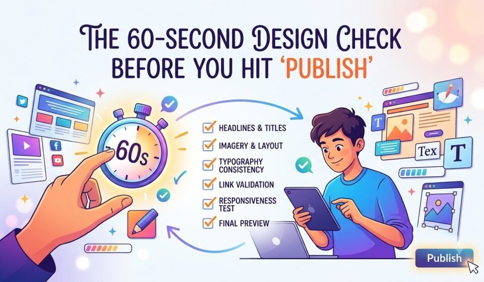

You’ve finished the design. The colours look right, the images are in place, the text is written, and you’re ready to publish.
But wait.
Before you click “Publish,” “Post,” or “Send,” give your design one final 60-second check.
Why? Because a design can look good at first glance and still have small problems that make it feel confusing, unprofessional, or difficult to read.
You don’t always need another hour of editing. Sometimes, you simply need one focused minute to check the basics.
Here is a quick seven-point design check you can use before publishing almost anything, from Instagram posts and advertisements to presentations, posters, websites, and marketing creatives.
1. Check the Visual Hierarchy.
Ask yourself one simple question: “What do I notice first?”
Every design needs a clear visual hierarchy.
The viewer should know what to look at first, second, and third without thinking about it.
Usually, your most important message should be the most noticeable element. This could be your headline, product, offer, or call to action.
Step back and look at your design for a few seconds.
Can you identify the main message immediately?
If everything looks equally important, your hierarchy is probably weak.
You can improve hierarchy by adjusting:
For example, if your headline, subheading, logo, and CTA are all the same size and weight, nothing stands out. The viewer has to work harder to understand the message.
Quick Test.
Squint at your design or look at it from a distance. The most important element should still stand out.
2. Check Your Spacing.
One of the easiest ways to make a design look messy is by ignoring spacing.
Look between your headline and subheading. Then check the space between paragraphs, images, buttons, icons, and other elements.
Are some elements too close together?
Are there awkwardly large gaps somewhere else?
Good spacing creates breathing room and helps different elements feel organised.
You don't need to fill every empty area. White space is not wasted space.
In fact, space can make important content easier to notice.
A useful trick is to check whether your spacing feels intentional. If two elements belong together, they can usually be closer. If they represent different sections, give them more space.
Quick Test.
Look only at the gaps between elements instead of the elements themselves. Do the spaces feel balanced?
3. Check the Contrast.
Contrast helps your design communicate clearly.
It can be created through:
The most important thing is that your text should be easy to see against its background.
A beautiful colour combination is useless if people cannot read the message.
For example, light grey text on a white background may look subtle, but it can be difficult to read, especially on mobile screens.
Also, check whether your main message has enough contrast compared to secondary information.
Quick Test.
Reduce the brightness of your screen slightly. If important text disappears into the background, your contrast needs improvement.
4. Check Your Typography.
Typography can make or break a design.
Before publishing, take a quick look at your font choices.
Ask:
Using five different fonts doesn't make a design more creative. It often makes it harder to understand.
For most designs, one or two well-chosen typefaces are enough.
Also check for small mistakes such as inconsistent capitalization, unnecessary bold text, missing punctuation, or accidental double spaces.
Quick Test.
Read your design only as text. If the words feel difficult to follow, fix the typography before publishing.
5. Check the Alignment.
Alignment is one of those details people may not consciously notice, but they definitely notice when it is wrong.
Look at your text, images, icons, buttons, and other elements.
Do they follow a clear alignment?
For example, if three text blocks are meant to be left-aligned, make sure they actually start from the same point.
Avoid placing elements randomly unless there’s a clear design reason.
Use invisible guides and grids when necessary. They help create consistency and make your layout feel intentional.
Quick Test.
Imagine drawing vertical and horizontal lines through your design. Do important elements line up?
If not, adjust them.
6. Check your Branding.
Before publishing a design for a business or personal brand, make sure it actually looks like it belongs to that brand.
Check:
Branding doesn't mean putting your logo everywhere.
A strong design can communicate a brand through its colour palette, typography, photography, shapes, and overall visual style, even when the logo is small.
If your previous five Instagram posts look completely different from the new one, ask whether the difference is intentional.
Consistency helps people recognize your brand.
Quick Test.
Place the new design next to your recent designs. Does it look like it belongs to the same brand?
7. Check the Readability.
Finally, stop viewing the design as a designer and look at it through the eyes of a normal viewer.
This is important.
You already know what the design is supposed to say, so your brain can automatically fill in missing information. Your audience doesn't have that advantage.
Check your design on the device where people will actually see it.
If it's an Instagram post, check it on a phone.
If it's a website banner, check it at different screen sizes.
If it's a presentation, check it from a distance.
Look for:
If someone needs to zoom in to understand your design, something needs to change.
Quick Test
Give the design to someone who hasn't seen it before and ask them what they noticed first and what the design is communicating. Their answer can reveal problems you didn't notice.
The 60-Second Final Checklist.
Before you hit publish, quickly ask:
If all seven answers are yes, your design is ready to go.
Good Design Is Often About What You Remove.
The final check isn't about endlessly editing your design.
In fact, sometimes the best improvement is removing something.
Small changes can make a big difference.
You don’t need to spend another hour staring at your design. Stop, step back, and check whether every element serves a purpose.
Before you hit “Publish,” take 60 seconds.
Your audience may never know you checked, but they’ll notice when your design feels clear, balanced, and easy to understand.