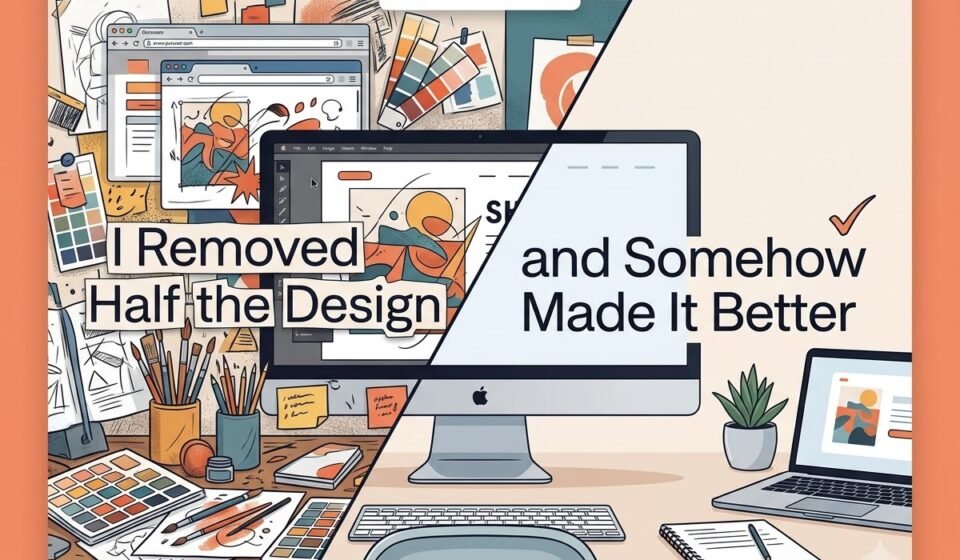

Sometimes, the biggest improvement you can make to a design is removing what doesn’t need to be there.
As designers, we often feel the need to fill space with more icons, colours, fonts, or graphic elements.
But good design isn’t about adding more. It’s about knowing what deserves to stay.
For this design makeover, I followed one simple principle: subtraction.
I removed unnecessary elements, reduced visual distractions, improved spacing, and strengthened the visual hierarchy. The final design had fewer elements, but communicated the message more clearly and effectively.
The Problem: When Everything Wants Attention.
Let’s imagine a promotional social media post for a fictional cafe.
The original design contains:
1. A large headline
2. A secondary headline
3. A product photograph
4. Three decorative shapes
5. Multiple icons
6. A logo
7. A discount badge
8. A “Buy Now” button text
9. Several lines of supporting text
10. Three different fonts
11. Multiple colours
12. Decorative patterns in the background
Individually, none of these elements is necessarily bad. The problem is that they’re all competing for attention.
When everything demands attention, the viewer doesn’t know where to look first: the headline, product, discount, logo, or supporting information.
The design is trying to communicate too much at once.
And when everything is important, nothing feels important.
Step 1: Remove the Unnecessary Elements.
The first step was simple: I started deleting.
Not redesigning. Not recolouring. Not adding better fonts and just deleting.
I removed decorative shapes that were not helping the message. Then I removed unnecessary icons and background patterns. I reduced the supporting text and removed information that could be communicated elsewhere.
The goal was not to make the design empty.
The goal was to ask one question for every element: “Does this help the viewer understand the message?”
If the answer was no, it had to go.
This is one of the most useful questions you can ask during a design project.
A design element should have a purpose. It may attract attention, provide information, create emotion, establish branding, guide the viewer, or improve readability.
If it is doing none of these things, it may simply be taking up space.
Step 2: Reduce the Number of Fonts.
The original design used three different fonts.
One for the main heading, another for the subheading, and another for the smaller text.
This made the design feel inconsistent.
Instead of using multiple fonts to create variety, I reduced the design to two typefaces or, depending on the project, even one font family with different weights.
The headline became bold and prominent.
The supporting text became smaller and lighter.
Now, viewers can immediately distinguish the main message from the supporting information.
Typography is not just about choosing attractive fonts. It is also about creating a clear reading order.
Step 3: Create a Stronger Hierarchy.
Once the unnecessary elements were removed, I could focus on hierarchy.
The design needed to answer three questions quickly:
1. What is this about?
2. What should I do next?
3. Why should I care?
The main headline became the first visual priority.
The product image became the second.
The supporting information was reduced and positioned where it could be read without competing with the headline.
Finally, the call-to-action was given enough importance to be noticed without becoming louder than the main message.
This created a natural visual journey.
Instead of the viewer looking everywhere, their eyes could move through the design in a logical order.
Step 4: Give the Design More Breathing Space.
One of the biggest changes came from something that was not added at all: white space.
White space is often misunderstood as wasted space.
It is not.
White space gives individual elements room to breathe. It separates different pieces of information and makes important elements easier to notice.
In the original design, the text, image, icons, and decorative elements were packed closely together.
After removing several elements, I increased the space between the headline, image, supporting text, and call-to-action.
The result immediately felt cleaner.
The interesting part is that the canvas itself had not changed.
There was no extra space.
I simply stopped trying to fill every available area.
Step 5: Make the Message Clearer.
A design can look beautiful and still fail if people do not understand it quickly.
This is especially important for social media graphics, advertisements, posters, and promotional designs.
People are usually not studying your design. They are scanning it.
That means the message needs to be understood with minimal effort.
By removing unnecessary text and visual elements, the main message became easier to identify.
Instead of asking the viewer to process ten different things, the design guided them towards the information that actually mattered.
That is the real benefit of subtraction.
It does not simply make a design look minimal.
It makes communication easier.
Before vs. After: What Actually Changed?
The final makeover did not depend on a dramatic colour change or a completely new concept.
The biggest improvements were surprisingly simple.
BEFORE:
AFTER:
1. Too many visual elements
2. Weak hierarchy
3. Multiple competing fonts
4. Tight spacing
5. Excessive decoration
6. Too much information
7. No obvious focal point
1. Fewer elements
2. Clear visual hierarchy
3. Consistent typography
4. Better spacing
5. More intentional white space
6. Shorter, clearer messaging
7. One strong focal point
The design became quieter, but the message became louder.
And that is the interesting part.
Minimal Does Not Mean Empty.
There is a common misunderstanding that minimal design means putting one image and two words on a white background.
That is not necessarily minimalism.
Minimal design is about intentionality.
Every element has a reason to exist.
You can have a colourful design with several elements and still create a clean visual experience if everything has a clear purpose.
At the same time, you can have a very simple-looking design that feels confusing because the typography, spacing, hierarchy, or composition is poorly handled.
So the goal should not be: “How little can I put on the canvas?”
Instead, ask: “What is the least I can show while still communicating the message effectively?”
That is a much better design question.
A Simple Subtraction Checklist.
Before publishing your next design, take a step back and review it.
Ask yourself:
1. Can I remove one decorative element?
2. Is every piece of text necessary?
3. Am I using too many fonts?
4. Does the headline stand out immediately?
5. Is there enough white space ?
6. Are multiple elements competing for attention?
7. Can the message be understood within a few seconds?
8. Does every colour have a purpose?
9. Is the call-to-action easy to find?
10. If I remove something, does the design actually become worse?
If removing an element makes the design clearer, it probably did not need to be there.
The Final Lesson: Design Less, Communicate More.
This makeover taught me something important: good design is not about how much you can add. It is about how carefully you can choose what stays.
Removing half the elements did not make the design weaker.
It gave the important elements more room to work.
The headline became easier to notice. The image became more impactful. The typography became more organised. The White space created breathing room. And most importantly, the message became clearer.
Sometimes, your design does not need another colour, another icon, another font, or another effect.
It simply needs you to press delete.
Because in graphic design, subtraction is not about making a design look empty.
It is about removing the noise so the message can finally speak.