
Have you ever looked at a design and thought, “It looks fine”?
Nothing seems obviously wrong.
The colours are decent, the text is readable, the images are okay, and all the information is there.
But then you see a professionally designed poster and immediately notice the difference.
The professional version feels cleaner, more organised and more intentional.
So, what actually changed?
The answer is not always a fancy font, expensive software or more design elements.
Often, the difference comes from better decisions.
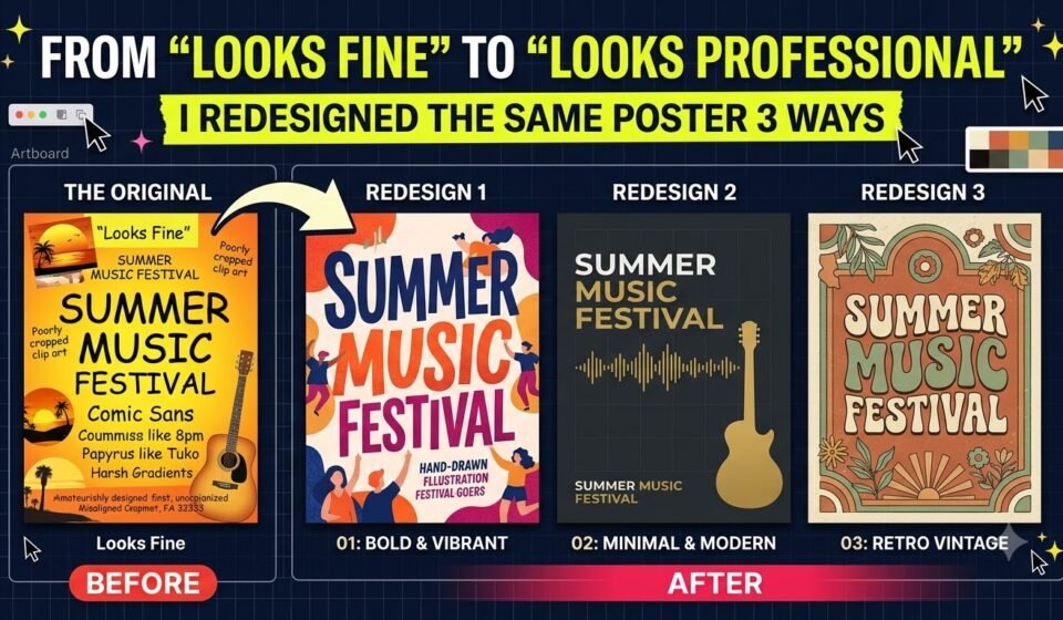
To explain this, let’s take one imaginary event poster and redesign it three times. Each version will improve, but the biggest improvement will not come from adding more. It will come from thinking more strategically.
The Starting Point: A Poster That “Looks Fine.
Imagine we are designing a poster for a fictional event:
The first version contains everything required. It has a large background image, a colourful title, several fonts, decorative shapes, the event details, and a big “Register Now” button.
Technically, there is nothing completely wrong with it.
But there is a problem.
Everything is trying to get attention at the same time.
The headline, image, date, decorative elements and button are all competing.
When everything is important, nothing feels important.
This is where the first redesign begins.
Version 1: Making It Cleaner.
The first goal is simple: Remove the visual noise.
I would start by removing unnecessary decorative elements. If there are five shapes around the headline, I might keep only one or two. If the background image is too busy, I would simplify or crop it.
Next comes typography.
Instead of using four or five different fonts, I would use one strong typeface with different weights and sizes.
For example:
Then the event details would have a consistent size and spacing.
I would also introduce more white space.
This is important because white space is not “space that needs filling”. It gives the viewer room to understand the information.
What changed?
1. Fewer decorative elements
2. Fewer fonts
3. Better spacing
4. Cleaner image treatment
5. More consistent alignment
6. Clearer text sizes
The poster now looks much better.
But there is still a problem.
It is clean, but it is not necessarily strategic.
It looks organised, but we haven't yet decided what the viewer should notice first.That brings us to Version 2.
Version 2: Creating a Clear Visual Hierarchy.
Now I stop asking, “How can I make this poster look better?”
Instead, I ask: “What should the viewer see first, second and third?”This changes the entire design process.
For an event poster, the event name is probably the first thing people should notice.
So I make SUMMER CREATIVE WORKSHOP the strongest element.
The supporting line comes next.
Then I make the date and location easy to find.
Finally, “Register Now” becomes the main action.
The poster now has a visual path:
Event → Benefit → Details → Action
This is visual hierarchy.
I might increase the headline size, reduce the size of secondary information and create stronger contrast between the important and less important elements.
I would also group related information.
For example:
Instead of scattering these details around the poster, I would keep them together.
This makes the information easier to scan.
What Changes?
1. Stronger headline
2. Clear information hierarchy
3. Better grouping of related content
4. Stronger contrast
5. More intentional placement
6. Clearer call-to-action.
Now the poster looks professional.
But there is still another level.
Good design isn't only about making information easy to read.
It is also about making the design communicate the right feeling to the right audience.
Version 3: Designing With Strategy.
This is where the biggest transformation happens.
Before touching the design, I would ask a few questions.
Who is this poster for?
Young creative professionals?
College students?Business owners?Children?The answer changes the design.
Let's say the target audience is young
creative professionals and design students.
The visual direction should feel energetic, creative and modern.
Instead of choosing colours simply because they look attractive, I would choose a visual style that matches the audience and event.
I recommend a bold typography-led layout, a strong but controlled colour palette, and an image that shows creativity rather than simply being decorative.
The headline could become more expressive.
Instead of treating “Register Now” as another piece of information, I would make it a clear action.
The information could be organised into sections:
Now every design element has a job.
The headline communicates.
The image supports the idea.
The colours create a mood.
The typography establishes personality.
The spacing creates breathing room.
The hierarchy controls attention.
The CTA tells the viewer what to do next.
This is no longer just a good-looking poster.It is a communication tool.
So, What Actually Made Version 3 Better?
The interesting part is that Version 3 may not contain more design elements than Version 1.
In fact, it could contain fewer.
The difference is intent.
Version 1 was created by asking: “What can I add to make this look attractive?”
Version 2 asked: “How can I organise this information better?”
Version 3 asked: “What does this audience need to notice, feel and do?”
That is the difference between decoration and design strategy.
A professional designer does not simply make things beautiful.
They make decisions based on a purpose.
The Real Lesson: Professional Design Is About Decisions.
There is a common misconception that professional graphic design means using advanced software, complicated effects or expensive fonts.
It doesn't.
You can create a technically impressive design that completely fails to communicate.
And you can create a relatively simple poster that works extremely well.
The difference is usually found in the decisions behind the design.
Before adding an effect, ask: What problem is this solving?
Before adding another colour, ask: Does this improve communication?
Before adding another font, ask: Does this create a meaningful difference?
Before adding another element, ask: Does the design actually need it?
These questions can dramatically improve your work.
Final Comparison...
Think of the three versions like this:
Version 1 — Clean
Goal: Remove unnecessary clutter.
The poster becomes easier to look at.
Version 2 — Organised
Goal: Create hierarchy and improve readability.
The poster becomes easier to understand.
Version 3 — Strategic
Goal: Connect the design with the audience, message and desired action.
The poster becomes more effective.
And that final step is what separates “looks fine” from “looks professional.”Professional design is not about making every element impressive.
It is about making every element intentional.
When the headline has a purpose, the image has a purpose, the colour has a purpose, the spacing has a purpose, and the call-to-action has a purpose, the design starts working as one complete system.
That is when a poster stops being just something that looks good.
It starts doing its job.