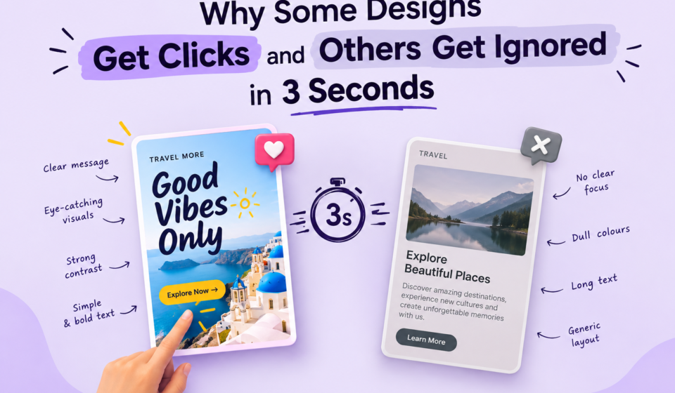

Have you noticed how some Instagram posts, ads, thumbnails, and banners instantly grab your attention, while others are easily ignored?
You may think the difference is simply having a beautiful design, but that’s not always the case.
Attractive colours, high-quality images, and stylish fonts don’t guarantee an effective design.
On the other hand, a simple design with basic elements can make you stop scrolling and look.
The reason is attention.
In today's digital world, people see hundreds of visual messages every day.
People don’t have the time or patience to study every design carefully. In many cases, you have only a few seconds to capture their attention and communicate your message.
This is where graphic design principles such as visual hierarchy, contrast, colour, typography, and composition become important.
Let's understand how each of these elements can influence whether people notice your design or ignore it.
1. Visual Hierarchy: Tell People What to Look at First.
Imagine a poster where the headline, image, price, description, logo, and button all compete equally for attention.
Where would you look first?
Probably nowhere specific.
This is exactly what happens when a design has weak visual hierarchy.
Visual hierarchy arranges design elements to guide the viewer’s eyes from the most important information to the least important.
For example, in a social media advertisement, the viewer should ideally understand:
What is this? → Why should I care? → What should I do next?
You can create hierarchy by changing:
1. Font Size
2. Font Weight
3. Colour
4. Position
5. Spacing
6. Scale
7. Image Size
For example, on a sale poster, “50% OFF” should stand out more than the small terms and conditions.
If everything is given equal importance, nothing stands out.
Good design makes the most important information clear at a glance.
2. Contrast: Make Important Elements Stand Out.
Contrast is one of the simplest ways to grab attention.
When two elements are significantly different, our eyes naturally notice the contrast.
Contrast can be created using:
1. Light and dark colours
2. Large and small text
3. Bold and regular fonts
4. Different shapes
5. Thick and thin elements
6. Different sizes
For example, black text on a white background has strong contrast and is easy to read. A bright yellow button on a dark background can immediately attract attention.
But contrast is not only about using opposite colours.
You can also create contrast through size.
For example, if a poster has a 60px headline and 18px supporting text, the difference in size immediately tells the viewer that the headline is more important.
However, too much contrast can make a design feel chaotic. If every element uses a different colour, size, and font, the viewer may not know where to look.
The goal is not to create contrast everywhere.
The goal is to create contrast where attention is needed.
3. Colour: Create Attention and Emotion.
Colour is one of the first things people notice in a design.
It can influence how a design feels and where the viewer looks.
For example, red can feel energetic, urgent, or powerful. Blue often communicates trust and professionalism. Green can be associated with nature, freshness, or growth. Yellow can feel cheerful and energetic.
But there is no universal rule that says one colour always means one specific emotion. Context matters.
For example, the same red can communicate excitement in a food advertisement but urgency in a warning message.
Colour can also help create visual hierarchy.
Suppose your entire design uses neutral colours and you use one bright colour for the "Buy Now" button.
That single colour becomes an attention point.
This is why randomly adding many attractive colours is usually a bad idea.
A better approach is to create a clear colour palette and use your strongest colour strategically.
Think of colour as an attention tool, not decoration.
4. Typography: Make the Message Easy to Notice and Read.
Typography is not simply about choosing a beautiful font.
It is about making communication clear.
A design can have excellent images and colours, but if the text is difficult to read, people will move on.
Typography influences attention through:
1. Font size
2. Font weight
3. Font style
4. Letter spacing
5. Line spacing
6. Text width
7. Font combinations
For example, a bold heading grabs attention, while regular text provides supporting information.
You don’t need five different fonts to make a design look interesting.
In many cases, one or two fonts are enough.
You can create variety by using different weights and sizes of the same font.
For example:
BIG HEADING.
Medium subheading.
Regular body text.
This creates a clear structure without making the design look messy.
Also, avoid placing long paragraphs in decorative fonts.
Fancy fonts may look attractive, but readability should always come first.
Remember: Typography should help people understand your message, not make them work to understand it.
5. Composition: Give Every Element a Proper Place.
Even with the right colours, fonts, and images, poor composition can make a design look ineffective and unprofessional.
Composition refers to how different design elements are arranged within a layout to create balance, flow, and visual harmony.
Think about your design as a room.
If furniture is randomly placed everywhere, the room feels uncomfortable.
But when everything has enough space and is placed properly, the room feels organised.
The same applies to graphic design.
Good composition helps create:
1. Balance
2. Alignment
3. Rhythm
4. White space
5. Flow
6. Focus
One common mistake beginners make is trying to fill every space.
They think an empty area means something is missing.
Actually, white space is one of the most useful tools in design.
It gives important elements room to breathe and helps the viewer focus on the message.
For example, if you have a headline, image, and call-to-action button, giving them enough space can make the design much easier to understand.
You should also pay attention to alignment.
When elements are properly aligned, the design feels more organised and professional.
The 3-Second Test...
Now let's put everything together.
Before publishing your next design, look at it for just three seconds.
Then ask yourself:
1. What did I notice first?
2. Was it the main message?
3. The product?The offer?The person's face?
Or was it simply a random element that happened to be the biggest or brightest?
If you cannot identify the main message quickly, your visual hierarchy may need improvement.
You can also temporarily blur your design or look at it from a distance.
If the main focus disappears, you may need to improve your contrast, composition, or hierarchy.
Final Thoughts
A design does not get attention simply because it looks beautiful.
It gets attention because it communicates clearly and guides the viewer's eyes.
Visual hierarchy tells people what to see first. Contrast makes important elements stand out. Colour attracts attention and creates a particular feeling. Typography makes the message readable and establishes importance. Composition brings everything together and creates a clear visual flow.
The best designers understand that every element has a job.
So, before adding another colour, another font, or another decorative element to your design, ask yourself: "Does this help the viewer understand the message, or am I adding it just because it looks good?"
Because when people have only a few seconds to decide whether something deserves their attention, clarity is not optional.
Good design does not make people work to understand. It makes the message obvious.