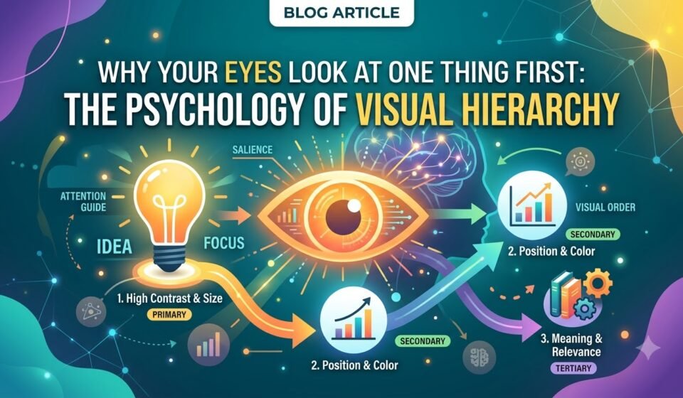

Have you ever looked at a poster, website, Instagram post, or advertisement and immediately noticed one particular element?
Maybe it was a large headline. Maybe a bright button caught your attention. Or perhaps an image pulled your eyes towards one corner of the design.
That is not an accident.
Good graphic design guides your eyes. It tells you what to notice first, what to look at next, and where to go after that. This is called visual hierarchy.
Visual hierarchy is one of the most important principles in graphic design because viewers rarely look at every element of a design with equal attention. Instead, their eyes naturally move towards the elements that stand out.
The interesting part is that designers can control this attention using simple things like size, contrast, colour, position, white space, and typography.
Let's understand how.
What Is Visual Hierarchy?
Visual hierarchy is the arrangement of design elements based on their level of importance.
Think about a newspaper. The main headline is usually large and bold. A subheading is smaller. The body text is even smaller. Images, captions, and other details are arranged around them.
This creates an order:
Look here first → then here → then here.
Without hierarchy, everything competes for attention. The viewer does not know where to start.
Imagine a poster where the headline, price, image, description, logo, and call-to-action button are all the same size and weight. Nothing feels important because everything is shouting at the same volume.
A strong design does the opposite. It creates a clear visual path.
Here are six major factors that control where your eyes go.
1. Size: Bigger Usually Gets Noticed First.
Size is one of the easiest ways to create hierarchy.
When one element is significantly larger than the others, our eyes naturally notice it first.
For example, imagine a promotional poster saying: 50% OFF
If “50% OFF” is large while the supporting information is smaller, your eyes will probably notice the offer first.
This is useful for:
However, making everything large defeats the purpose.
If your headline, subheading, image, button, and logo are all huge, there is no clear starting point.
The Lesson -
Use size differences intentionally. Make the most important element visually dominant.
2. Contrast: Make Important Things Stand Out.
Contrast means creating a noticeable difference between elements.
It can come from:
For example, a black headline on a white background has strong contrast and is easy to notice.
A small grey headline on a slightly lighter grey background has much less contrast and may disappear into the design.
Contrast is especially important when you want someone to take action.
Think about a website's “Buy Now” or “Get Started” button. If the button looks exactly like every other element, people may ignore it. A stronger contrast can make the action more noticeable.
But contrast should have a purpose. If every element has maximum contrast, the design becomes visually noisy.
The Lesson -
Don't make everything stand out. Make the important things stand out.
3. Colour: Your Eyes Notice What Feels Different.
Colour can immediately attract attention.
Imagine a mostly black-and-white poster with one bright red word. Your eyes will probably go straight to that red element.
This happens because the colour creates contrast with its surroundings.
Colour can therefore be used to:
But colour is not only about choosing something bright.
A muted colour can become powerful when everything around it is neutral. Similarly, a bright colour loses its impact when you use it everywhere.
For example, if every heading on your website is bright orange, orange stops being special. But if you use orange only for important buttons or keywords, it becomes an attention signal.
The Lesson -
Colour works best when it has a clear job.
4. Position: Where You Place Something Matters.
Where an element appears on the page can influence how quickly people notice it.
Elements placed in prominent positions often receive more attention than elements hidden in crowded or less noticeable areas.
For example, on a website, the main headline is often placed near the top of the page because it immediately communicates what the page is about.
Similarly, a call-to-action may be placed where the viewer naturally reaches after reading the main information.
Position also helps create a reading flow.
A designer might arrange a poster like this:
Headline → Image → Supporting information → Call to Action
The viewer naturally moves through the design in that order.
But position should not be treated as a rigid rule. Different layouts, cultures, languages, and content types can influence how people scan a design.
The important point is to think about the journey you want the viewer to take.
The Lesson -
Don't just ask, “Where does this element look good?” Ask, “Where should the viewer see it?”
5. White Space: Empty Space Is Doing a Job.
One of the biggest misconceptions in graphic design is that space means wasted space.
It doesn't.
White space, also called negative space, is the empty area around and between design elements.
It gives your content room to breathe.
Compare two designs.
The first has text, images, icons, buttons, and logos packed tightly together.
The second has fewer elements with comfortable spacing around them.
The second design will usually feel easier to understand.
Why? Because white space separates information.
It helps the viewer understand which elements belong together and which ones are separate.
White space can also make an important element feel more important.
Imagine a small headline sitting in the middle of a large empty area. Even though the text is not huge, the surrounding space gives it attention.
The Lesson -
Don't fill every empty area just because you can. Sometimes space is what makes the design work.
6. Typography: Words Have Visual Importance Too.
Typography is not simply about choosing a beautiful font.
The way text is designed can strongly influence visual hierarchy.
Consider a typical content structure:
Body text is smaller and comfortable to read.
This creates different levels of importance.
You can create typographic hierarchy using:
For example, a bold display font might be suitable for a powerful campaign headline, while a simple sans-serif font may work better for supporting information.
The key is consistency.
If every sentence is bold, uppercase, colourful, and oversized, nothing feels important anymore.
The Lesson -
Typography should create an order of information, not just make the design look attractive.
How These Elements Work Together.
The real power of visual hierarchy comes from combining these principles.
Imagine you're designing an Instagram advertisement for a clothing brand.
You might use:
None of these techniques needs to work alone.
Together, they create a visual path.
A Simple Visual Hierarchy Test.
Before publishing your design, try this simple test: Look at your design for three seconds. Then look away.
Ask yourself:
1. What did I notice first?
2. What did I notice second?
3. Was the main message clear?
4. Did I notice the call-to-action?
5. Was anything competing unnecessarily for attention?
If the answer to the first question is your logo when your main goal was to promote an offer, your hierarchy may need some work.
Similarly, if you notice a decorative graphic before the actual message, the decoration may be too dominant.
Good hierarchy makes the viewer's experience feel effortless.
The Biggest Mistake: Making Everything Important.
This is where many designs go wrong.
Designers often try to make every piece of information noticeable.
The headline is bold.
The subheading is bold.
The price is huge.
The description is colourful.
The button is bright.
The logo is oversized.
The result?
Nothing feels important anymore.
Hierarchy requires prioritisation.
You need to decide:
What should the viewer see first?
Then:
What should they see next?
And finally:
What information can they discover afterwards?
Once you answer these questions, your design decisions become much easier.
Final Thoughts...
Visual hierarchy is essentially the art of controlling attention.
Your audience may not consciously notice the size of your headline, the contrast of your button, the placement of your image, or the amount of white space, but their eyes respond to all of these choices.
That is why good design is not simply about making something beautiful.
It is about making information easy to understand.
The next time you create a poster, social media post, website, presentation, or advertisement, don't just ask:
“Does this look good?”
Ask:
“What do I want people to see first?”
Then design everything else around that decision.
Because when your visual hierarchy is right, you don't have to fight for attention.
Your design naturally leads the viewer's eyes exactly where they need to go.