
Have you ever looked at a design and thought, “Something feels wrong”, but you couldn’t figure out exactly what?
The colours look good. The fonts seem fine. The images are attractive. The content is correct. Yet, the overall design somehow looks unprofessional.
Very often, the problem is alignment.
Alignment is one of those design principles that people may not consciously notice, but they definitely notice when it is wrong. Even a small misalignment between a heading, image, button, or paragraph can make an otherwise good design look messy and amateurish.
The good news? You don't need to completely redesign your work.
Sometimes, you simply need to fix where things sit.
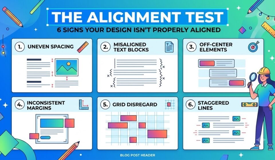
Here are six common signs that your design isn't properly aligned—and how to fix them.
1. Your Text Blocks Don't Share the Same Starting Point.
Look at your heading, paragraph, subheading, and button.
Do they begin from the same vertical line?
If your heading starts slightly to the left, your paragraph starts a little further right, and your button moves somewhere else, the design can immediately feel disconnected.
This is especially noticeable in posters, social media graphics, websites, presentations, and advertisements.
How to fix it?
Choose a clear alignment line and use it consistently.
For example:
Can all begin from the same left edge.
Use guides, grids, or rulers in your design software to make this easier.
Don't rely only on your eyes. A difference of just a few pixels can be hard to notice while designing, but obvious when you view the final design as a whole.
QUICK TEST.
Zoom out and look at the left edges of your text. If they create a clean, invisible line, your alignment is probably working.
2. Your Elements Look Almost Aligned but Not Quite.
This is one of the most frustrating alignment problems.
Two elements may look aligned at first glance, but one is actually a few pixels higher or lower.
For example, imagine two cards on a website. Their top edges should line up, but one sits slightly lower.
Nothing is dramatically wrong, but the design feels uncomfortable.
This happens frequently when designers manually drag elements around instead of using alignment tools.
How to fix it?
Stop guessing.
Use the Align and Distribute tools in Figma, Canva, Illustrator, Photoshop, or other design software. If two elements share an edge, align them mathematically rather than visually. For multiple elements, use equal spacing instead of adjusting each one manually.
The goal isn’t perfection for perfection’s sake, it’s visual consistency.
3. Your Spacing Is Inconsistent.
Alignment isn't only about whether objects are on the same line. It is also about how they relate to the space around them.
Imagine a design where:
Nothing is technically “misaligned”, but the inconsistent spacing makes the layout feel random.
How to fix it?
Create a simple spacing system.
For example, you might work with multiples such as:
8px → 16px → 24px → 32px → 48px
You don't have to follow these exact numbers in every design, but having a consistent spacing system helps create rhythm.
Think of spacing as the invisible structure holding your design together.
When the spacing is intentional, the design feels organised.
When it is random, the design feels accidental.
4. Your Images and Text Don't Work on the Same Grid.
A common mistake is aligning text separately from images.
For example, your text may begin at one point while the image beside it extends slightly beyond the main content area.
This can make the design feel unbalanced.
Grids are particularly useful here.
A grid gives you an invisible structure that helps different elements relate to one another.
How to fix it?
Before placing your elements, decide on your main grid.
For a simple layout, you might have:
Margin → Content → Gap → Image → Margin
Then make sure your text, images, buttons, and other elements respect that structure.
This doesn't mean every element must sit perfectly inside a box. Breaking the grid can also create interesting designs.
But here's the important part: Break the grid intentionally, not accidentally.
If you're going outside the grid, there should be a visual reason for doing it.
5. Your Centre Alignment Is Making the Design Feel Unbalanced.
Centre alignment looks simple, but it is surprisingly easy to get wrong.
Designers sometimes centre everything because it feels safe.
The problem is that mathematical centre and visual centre aren't always the same.
For example, an image with a lot of space on one side may technically be centred but still look visually shifted.
The same can happen with typography. A short heading may appear centred differently from a longer paragraph even when both are mathematically centred.
How to fix?
First, use your software's centre alignment tool.
Then step back and look at the design as a whole.
Ask: “Does this actually feel centred?”
If it doesn't, make a small visual adjustment.
But don't randomly move elements until they “feel right”. Make sure you understand why something feels unbalanced before changing it.
6. Your Design Has Too Many Different Alignment Directions.
This is where a design can quickly become chaotic.
Imagine one heading aligned left, another centred, an image aligned right, a paragraph centred, and a button floating somewhere in between.
Each element may look fine on its own. Together, they create visual confusion.
Alignment creates relationships between elements. When too many alignment directions are used without a clear reason, those relationships become weak.
How to fix it?
Choose a dominant alignment style.
For example -
You can combine different alignments, but give each one a purpose.
For example, a poster might have a centred headline but left-aligned supporting information.
The key is to create order, not uniformity.
The 30-Second Alignment Test.
Before you publish your design, take 30 seconds to check these six things:
If you find even one major problem, fix it before publishing.
You can also try a simple trick: zoom out or squint at your design.
When you reduce the amount of detail you can see, alignment problems often become easier to spot because your brain starts seeing the overall structure rather than individual elements.
Final Thoughts...
Good alignment is not about making every element perfectly symmetrical.
It is about creating relationships.
Your heading should relate to your paragraph. Your image should relate to your text. Your button should feel connected to the content around it. Your spacing should create a clear visual rhythm.
When these relationships are consistent, a design feels intentional.
When they aren't, even beautiful colours, professional fonts, and high-quality images can't completely save it.
So the next time your design feels “almost right” but somehow wrong, don't immediately change the colour palette or choose another font.
Run the alignment test first.
Sometimes, the problem isn't what you designed.
It's where you placed it.