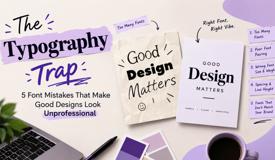

A design can have beautiful colours, attractive images, and a creative layout, yet still look unprofessional. The reason? Poor typography.
Typography is more than just choosing attractive fonts. It is about how text looks, feels, and communicates with the audience. The right font can make a design look modern, elegant, bold, or trustworthy. On the other hand, the wrong font choices can make even a well-designed poster, website, or social media post look confusing.
Whether you are a graphic designer, business owner, or content creator, understanding typography is essential. Let's explore five common font mistakes that can affect your design and how to fix them.
1. Using Too Many Fonts.
Using too many fonts is a common typography mistake. With thousands of typefaces available in tools like Canva, Photoshop, and Illustrator, it’s easy to get carried away. However, mixing too many fonts can create visual confusion and make a design look cluttered.
For example, a poster that combines a decorative heading, handwritten subheading, serif body text, and a stylish CTA can create visual competition rather than a clear hierarchy.
How to fix it:
a) Limit your design to two or three font families.
b) Use different font weights and sizes to create variety.
c) Choose one font for headings and another for body text.
d) Maintain consistency across all design elements.
Remember, good typography is not about using more fonts. It is about using the right fonts effectively.
2. Choosing the Wrong Font Pairing.
Not every attractive font looks good when combined with another. Poor font pairing can hurt readability, visual balance, and a design's overall appearance.
For example, combining two highly decorative fonts can make a poster difficult to read. Similarly, pairing two fonts with very similar styles may create little visual distinction between headings and body text.
A good font combination should create contrast without making the design feel disconnected.
How to fix it:
a) Pair a serif font with a clean sans-serif font for contrast.
b) Use a decorative font only for short headings or highlights.
c) Check whether both fonts complement each other's proportions and visual style.
d) Test your font combinations at different screen sizes.
For example, pairing Playfair Display for headings with Poppins for body text can balance elegance with modern simplicity.
The goal is to create a clear visual hierarchy where viewers can easily identify the main message and supporting information.
3. Ignoring Font Size, Weight, and Visual Hierarchy.
Imagine visiting a website where the heading is almost the same size as the body text. You may struggle to identify the main message or understand where to focus first.
This happens when designers fail to establish a proper visual hierarchy.
Font size and weight create visual hierarchy. Large, bold headings draw attention, while smaller, lighter text supports the main message.
However, making every heading bold or every important sentence oversized does not solve the problem. It creates unnecessary competition.
How to fix it:
a) Use larger font sizes for main headings.
b) Keep body text comfortable to read.
c) Avoid using too many font weights in one design.
d) Maintain a consistent hierarchy across different sections.
e) Use bold or semibold weights to highlight important information.
For example, a website might use a 36 px heading, a 20 px subheading, and 16 px body text, with sizes adjusted to suit the layout and device.
A clear hierarchy allows viewers to scan content and understand what matters most.
4. Overlooking Letter Spacing, Line Spacing, and Alignment.
Typography is not only about choosing the right font. Spacing also plays a major role in how professional a design looks.
Text that is too tightly packed can feel crowded, while excessive spacing can make words difficult to read. Poor line height can make paragraphs look messy, especially in websites, brochures, and social media graphics.
For example, a paragraph with very little space between lines may appear like a solid block of text. Similarly, excessive letter spacing in body text can interrupt the natural reading flow.
How to fix it:
a) Adjust letter spacing according to the font and design purpose.
b) Use comfortable line height for paragraphs.
c) Avoid squeezing text into small spaces.
d) Maintain consistent alignment throughout the layout.
e) Leave enough white space around text elements.
For body text, a line height of around 1.4 to 1.6 times the font size is a useful starting point. Headings may need tighter line spacing, depending on the typeface and layout.
Small spacing adjustments can make a significant difference. They improve readability and give the design a cleaner, more balanced appearance.
5. Choosing Fonts That Do Not Match the Brand Personality.
Every brand has a personality. Some brands want to appear luxurious and elegant, while others prefer a playful, friendly, or professional identity.
Using a font that does not match that personality can send the wrong message to the audience.
For example, a luxury skincare brand using a cartoon-style font may struggle to communicate sophistication. Similarly, a children's toy brand using an overly formal corporate typeface might feel less welcoming.
How to fix it:
Before selecting fonts, understand the brand's identity and target audience.
Always consider readability, brand consistency, and the context in which the font will appear.
A good font should not only look attractive but also communicate the right feeling and make the brand recognizable.
Before and After: How Typography Transforms a Design.
Let's consider a simple promotional poster for a digital marketing course.
Before: The typography trap
The original poster uses four different fonts: a decorative heading font, a handwritten subheading, and two body fonts. The oversized heading, cramped body text, and low-contrast CTA make the design feel cluttered and difficult to read.
Although the poster contains all the necessary information, the viewer struggles to identify the main message. The overall design feels cluttered and inconsistent.
After: A clean and professional design
The improved version uses two complementary fonts: a bold sans-serif for the heading and a clean, readable font for the supporting text. The heading stands out without feeling overwhelming, while consistent text sizes and comfortable line spacing improve readability. A contrasting colour highlights the CTA, and ample white space clearly separates each section.
The result is a more organised and visually appealing poster. Viewers can quickly understand the course offering, find key details, and notice the CTA.
No new images, complex graphics, or additional colours are needed. A few thoughtful typography changes are enough to transform the overall design.
Final Thoughts...
Typography can make or break a design. Common mistakes such as using too many fonts, poor font combinations, weak hierarchy, inconsistent spacing, and fonts that do not match the brand can reduce the overall quality of a design.
The solution is not to use complicated typefaces or follow every design trend. Instead, focus on readability, consistency, contrast, and purpose.
Before finalizing a design, ask yourself: Is the message easy to read? Do the fonts work well together? Does the typography reflect the brand’s personality?
Often, the biggest improvement comes from removing unnecessary elements rather than adding more.
Good typography does not demand attention; it guides attention in the right direction.