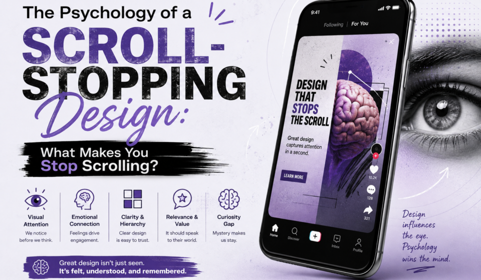

Have you ever opened Instagram and started scrolling without even thinking about it? You see hundreds of posts, reels, ads, and videos, but only a few make you stop.
Why?
It is not always because the content is better. Sometimes, the design simply catches your attention at the right moment.
In today’s digital world, people are exposed to an enormous amount of visual content every day. Instagram feeds, YouTube thumbnails, websites, advertisements, banners and even emails are all competing for a few seconds of our attention.
This is where design psychology becomes important.
A good designer does not only make something beautiful. A good designer understands how people look, what they notice first, what creates curiosity, and what makes them continue engaging with the content.
But there is an important difference between grabbing attention and manipulating people. The goal should not be to trick someone into clicking. The goal should be to make the right information noticeable, understandable and interesting.
Let’s understand what actually makes a design scroll-stopping.
1. Our Brain Notices What Is Different.
When you scroll through a feed, your brain doesn't carefully examine every post. That would require too much mental effort.
Instead, your brain quickly scans the environment and notices what stands out.
This is why contrast is one of the most powerful tools in design.
Imagine a feed filled with white and beige posts. Suddenly, you see a bright yellow graphic with large black text. Your eyes are more likely to notice it because it is visually different from what surrounds it.
Contrast can come from:
1. Colour
2. Size
3. Shape
4. Typography
5. Spacing
6. Position
7. Movement
However, using contrast does not mean making everything bright and loud.
If every element is competing for attention, nothing becomes important.
A better approach is to create one clear visual focal point.
2. The First Few Seconds Matter.
On platforms like Instagram and YouTube, people make very quick decisions.
When someone sees a Reel, they may decide within a moment whether they want to continue watching. Similarly, a YouTube thumbnail needs to communicate its basic idea before someone decides whether to click.
This is why the visual hook matters.
For example, instead of designing a Reel cover that simply says: “Graphic Design Tips”.
You could write: “Your Designs Look Bad Because of This”.
The second version creates curiosity.
But there is an important ethical rule here: the design must deliver what it promises.
If your headline creates curiosity but the content has nothing useful behind it, you may get a click, but you lose trust.
Attention without value is not good design. It is just clickbait.
3. Visual Hierarchy Tells People Where to Look.
One of the biggest mistakes beginners make is giving every element the same importance.
Imagine a poster where the headline, subheading, image, logo, price and button are all equally large and bold. Where should the viewer look first?
They will probably feel confused.
Visual hierarchy solves this problem.
A designer creates a clear order of importance.
For example:
1. Main headline
2. Supporting information
3. Image or visual
4. Call to action
5. Branding
This creates a natural path for the viewer's eyes.
You can create hierarchy through differences in:
1. Font size
2. Font weight
3. Colour
4. Position
5. Scale
6. Spacing
7. Contrast
Good hierarchy does not force people to look at something. It guides their attention naturally.
4. Faces and Emotions Are Powerful.
Humans naturally pay attention to faces.
This is one reason why thumbnails, advertisements and social media posts often use facial expressions.
A face showing surprise, happiness, confusion or excitement can immediately communicate an emotion.
For example, compare these two YouTube thumbnail concepts:
Thumbnail A - A plain laptop image with the text “Digital Marketing Course”.
Thumbnail B - A person looking surprised at a laptop with the text “I Tried Digital Marketing for 30 Days.”
The second thumbnail gives the viewer both an emotional signal and a story.
But again, exaggeration can become misleading.
If the person is shocked simply because the designer wants more clicks, even though nothing shocking happened, the design is using emotion dishonestly.
Ethical design uses emotion to communicate, not deceive.
5. Our Eyes Look for Familiar Patterns.
People process familiar visual patterns faster.
For example, when you see a shopping website, you already expect certain things: product images, prices, navigation menus, buttons and categories.
When a website follows familiar patterns, users can understand it more easily.
This does not mean every design should look boring.
A designer can introduce creativity while maintaining usability.
For example, you can use an unusual layout, but the navigation should still be understandable. You can use a unique font, but the main information should remain readable.
Creativity attracts attention. Familiarity reduces confusion.
Good design balances both.
6. Colour Can Influence Attention.
Colour is another important psychological tool.
Different colours can create different feelings and associations. Red may communicate urgency or energy. Blue can often feel calm or professional. Yellow can feel energetic and noticeable.
But colour psychology is not a fixed formula.
A colour does not automatically create a specific emotion for every person. Culture, context, personal experience and surrounding colours also matter.
For designers, the more useful question is: “Does this colour support the message?”For example, if you are designing a luxury brand, using a very playful and neon colour palette may not communicate the intended personality.
Similarly, if you are designing an emergency announcement, extremely soft colours may reduce the sense of urgency.
Colour should have a purpose, not just decoration.
7. Negative Space Gives the Brain Room.
One of the most underrated elements of scroll-stopping design is space, also called negative space.
Beginners often think that an empty area means something is missing.
Actually, space can make important elements more noticeable.
Imagine a headline surrounded by ten different objects. It may get lost.
Now place the same headline in a clean layout with enough breathing room around it.
Suddenly, it feels more important.
Negative space improves:
1. Readability
2. Focus
3. Visual balance
4. Information hierarchy
5. Overall appearance.
Sometimes, the best way to make something stand out is to remove things around it.
8. Designing for Different Platforms.
A scroll-stopping design does not look the same everywhere.
a) Instagram: Instagram is highly visual and fast-paced. Strong composition, readable typography, contrast and an interesting first frame can help stop the scroll.
b) YouTube: YouTube thumbnails need to work at a small size. A complicated thumbnail with tiny text may become unreadable. One strong image, a clear subject and a short message can work better.
c) Websites: Websites require more than attention. They need clarity and usability. A beautiful homepage is useless if visitors cannot understand what the business does or where they should click.
d) Advertisements: Ads have an additional challenge. They need to attract attention while communicating a clear offer.
The design should quickly answer:
What is this?
Who is it for?
Why should I care?
What should I do next?
The platform changes, but the basic principle remains the same: make important information easy to notice and understand.
9. Ethical Attention Is Better Than Manipulation.
Designers have a lot of power.
A strong visual can influence what people notice, what they remember and sometimes what they buy.
That power should be used responsibly.
Avoid misleading headlines, fake urgency, confusing buttons, hidden information or visuals that promise something the content cannot deliver.
Instead, use design to make genuine value more visible.
If your content is useful, your design should help people discover it.
If your product is good, your advertisement should communicate its benefits clearly.
If your website is helpful, your interface should make navigation easier.
That is ethical attention design.
The goal is not: “How can I trick people into stopping?”
The better question is: “How can I make the right person notice this and immediately understand why it matters?”
Final Thoughts...
A scroll-stopping design is not simply a colourful graphic with a huge headline.
It is the result of understanding how people process information.
Contrast helps something stand out. Visual hierarchy tells people where to look. Faces and emotions create connection. Colour supports the message. Negative space creates focus. Familiar patterns improve understanding.
Most importantly, good design respects the viewer's attention.
In a world where everyone is fighting for attention, the designers who stand out will not necessarily be the ones shouting the loudest.
They will be the ones who know what deserves attention, why it deserves attention, and how to communicate it clearly.
Because the real purpose of scroll-stopping design is not just to make someone stop scrolling.
It is to make them feel that stopping was worth it.