
Have you ever looked at a design and thought, “Something is not right,” but you could not explain what the problem was?
The colours may look fine. The images may be good. The information may all be there. Still, the design feels messy, confusing, or simply unprofessional.
That is the interesting thing about graphic design. A design does not have to be completely wrong to be ineffective. Sometimes, a few small mistakes in spacing, typography, alignment, colour, or hierarchy can make a big difference.
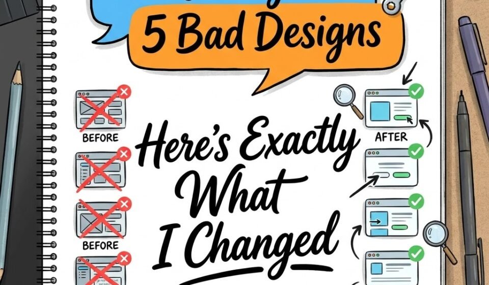
So, instead of only talking about common design mistakes, I decided to take five intentionally weak designs and redesign them from scratch.
The goal was not to make them more decorative. The goal was to make them clearer, more attractive, easier to understand, and more effective.
Here is exactly what I changed.
1. The Overcrowded Instagram Post.
The Problem
The first design was an Instagram promotional post with too much information.
It had a large headline, a long paragraph, several icons, multiple colours, a logo, contact details, and a decorative background.
Everything was competing for attention.
The biggest problem was visual hierarchy. When everything looks important, nothing actually looks important.
What I Changed
Step 1: Removed unnecessary elements
I started by removing information that was not essential to the main message. This immediately created more breathing space.
Step 2: Created a clear headline
I made the main message larger and more prominent. The viewer should understand the purpose of the post within a few seconds.
Step 3: Reduced the colours
Instead of using several bright colours, I selected a limited colour palette. One primary colour, one supporting colour, and a neutral background were enough.
Step 4: Improved spacing
I increased the space between different sections and avoided pushing everything towards the edges.
The Result
The redesigned post looked much cleaner without actually losing important information.
The biggest lesson is simple: you don't need to add more to make a design better. Sometimes, you need to remove things.
2. The Badly Formatted Event Poster.
The Problem
The second design was an event poster.
The event name was almost the same size as the date, the venue information was difficult to find, and the text was spread randomly across the layout.
There was no clear reading order.
A viewer had to search for the important information instead of being guided towards it.
What I Changed
Step 1: Established hierarchy
I divided the information into three levels:
1. Event name
2. Date and important details
3. Supporting information
The event name became the strongest element.
Step 2: Used alignment
Instead of placing text wherever there was space, I created a consistent alignment system.
Alignment gives a design structure. Even when viewers do not consciously notice it, they can feel when elements are properly organised.
Step 3: Grouped related information
The date, time, and venue were placed together because they belong to the same information group.
This made the poster much easier to scan.
Step 4: Created breathing space
I gave each section enough room instead of filling every empty area.
The Result
The redesigned poster had a much clearer reading flow.
The viewer could quickly answer three questions:
What is happening?
When is it happening?
Where is it happening?
That is what a good poster should do.
3. The Typography Disaster.
The Problem
The third design had a common mistake: too many fonts.
There were different fonts for the heading, subheading, body text, buttons, and small information. Some were bold, some decorative, and some handwritten.
Individually, the fonts were attractive. Together, they created visual confusion.
What I Changed
Step 1: Reduce the number of fonts
I used only two font families: one for the heading and another for supporting text.
In some cases, even one font family can be enough if you use different weights and sizes properly.
Step 2: Created type hierarchy
The heading became bold and large.
The subheading was smaller but still noticeable.
The body text was regular and comfortable to read.
This created a natural reading order.
Step 3: Improved line spacing
The original paragraph was cramped. I increased the line spacing so the text could breathe.
Step 4: Controlled text width
Long lines of text are difficult to read, especially in social media graphics and web layouts. I reduced the text width and divided information into smaller sections.
The Result
The design immediately looked more professional.
This redesign proved something important: good typography is not about finding the most beautiful font. It is about making information easy to read and giving every piece of text the right importance.
4. The Colour Overload.
The Problem
The fourth design had almost every bright colour you could imagine.
Pink, yellow, blue, green, orange, and purple were all used together.
The designer was probably trying to make the design energetic and attractive.
Instead, the colours were fighting with each other.
What I Changed
Step 1: Identified the purpose
Before choosing colours, I asked: What should this design communicate?
The design needed to feel modern, friendly, and energetic.
Step 2: Create a simple palette
I selected a primary colour, a secondary colour, and neutral colours for balance.
Step 3: Used contrast strategically
Instead of making every element colourful, I used contrast only where attention was needed.
For example, the main call-to-action received stronger contrast while supporting information remained quieter.
Step 4: Reduced decorative colour
Some colours were removed entirely because they were distracting from the main message.
The Result
The redesigned version still felt energetic, but it was much easier to look at.
This highlights an important design lesson: colour should guide attention, not compete for it.
5. The ‘Everything Is Important’ Website Banner.
The Problem
The final design was a website banner containing a headline, subheading, product image, discount, button, icons, logo, and several promotional messages.
The problem was obvious after looking at it for a few seconds: there was no clear focal point.
The viewer did not know where to look first.
What I Changed
Step 1: Chose one main message
I decided what the viewer absolutely needed to notice first.
That became the headline.
Step 2: Created a visual focal point
The product image was positioned so that it supported the headline instead of competing with it.
Step 3: Simplified the offer
Instead of showing multiple promotional messages, I highlighted one main offer.
Step 4: Strengthened the CTA
The button became visually distinct and clearly communicated the next action.
Step 5: Balanced the composition
I adjusted the size and position of the elements so that one side did not feel unnecessarily heavy.
The Result
The banner became easier to understand at a glance.
And that is especially important for digital design.
People do not usually study a website banner. They scan it.
Your design needs to communicate before the viewer loses interest.
What These 5 Redesigns Taught Me.
After redesigning all five designs, I noticed something interesting.
None of the original designs necessarily needed more creativity.
They needed better decisions.
The biggest improvements came from simple design principles:
1. Create hierarchy:
Make it obvious what the viewer should see first, second, and third.
2. Give elements space:
Empty space is not wasted space. It helps important elements stand out.
3. Keep typography under control:
You do not need five different fonts to make a design interesting.
4. Use colour with purpose:
A limited colour palette can often communicate more effectively than a rainbow of colours.
5. Remove what does not help:
One of the most underrated design skills is knowing what not to include.
6. Design for the viewer:
A design should not only look good to the person who created it. It should work for the person seeing it.
The Biggest Lesson: Good Design Is About Decisions.
When a design looks bad, the solution is not always to add more elements.
Often, the better solution is to remove what is unnecessary and give the existing elements more space to breathe.
More graphics, more colours, more fonts, more effects, and more information will not automatically make a design better.
In fact, they can make it worse.
Good graphic design is often about making decisions:
What should stand out?
What can be removed?
What needs more space?
What should be smaller?
Which colour actually serves the message?
Can someone understand this design in a few seconds?
That is the difference between simply making something look attractive and actually designing with purpose.
Turn One Redesign Into a Content Series.
This type of redesign can also become a recurring series on a graphic design website.
Instead of publishing one article and stopping there, you can create:
“I Redesigned 5 Bad Designs”.
Then continue with:
1. Bad social media ads
2. Bad restaurant menus
3. Bad business cards
4. Bad presentation slides
5. Bad website banners
6. Bad event posters
7. Bad logos
8. Bad YouTube thumbnails.
Each article can show the original design, the problems, the redesign process, and the final result.
This makes the content much more interesting than simply explaining design theory.
More importantly, it allows potential clients to see how you think as a designer.
And that is what a portfolio website should ultimately do.
A client is not only hiring someone who can use Canva, Photoshop, Illustrator, or other design tools.
They are hiring someone who can look at a problem, understand the audience, make smart visual decisions, and turn information into a design that works.
That is the real purpose of graphic design.