
Imagine you have one simple message:
“Start your journey to better fitness today.”
The message is clear. But would you design it the same way for a college student, a corporate professional, and a luxury wellness client?
Probably not.
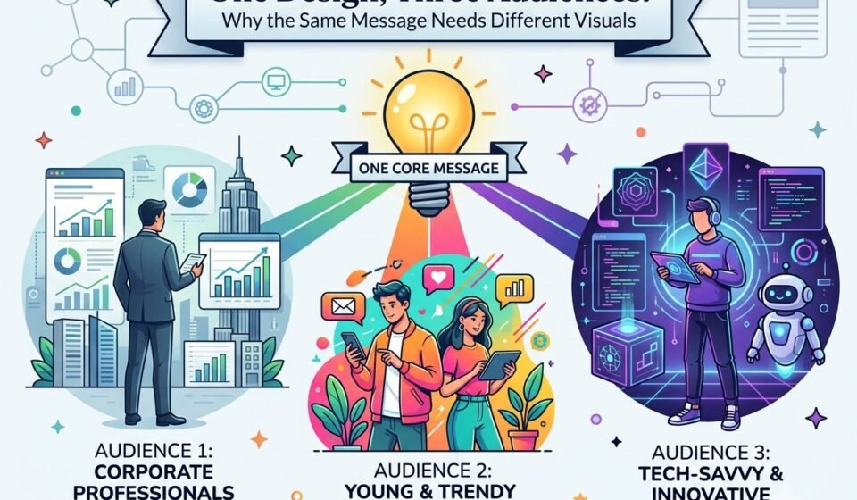
The words may stay the same, but the visual language should change based on the audience.
This is a key principle of graphic design: good design isn’t just about looking attractive. It’s about helping the right people notice, understand, and connect with the message.
A design that works well for one audience can completely miss the mark with another.
Let’s take the same fitness message and redesign it for three very different audiences: Gen Z, professionals, and a luxury audience.
The Message Stays the Same, the Design Changes.
Our basic message is:
“Start your journey to better fitness today.”
The goal is to encourage people to begin a fitness programme.
Now, instead of immediately choosing colours, fonts, images, and layouts, we first need to ask:
Who are we designing for?
This question changes almost every visual decision.
1. Designing for Gen Z.
Gen Z audiences generally interact with brands through fast-moving digital platforms such as Instagram, YouTube, and short-form content.
They are constantly exposed to visual content, so a design needs to communicate quickly.
The Visual Direction.
For this audience, I would create a design that feels energetic, bold, modern, and highly visual.
I might use:
The headline could become: “YOUR FIT ERA STARTS NOW.”
The supporting text could be: Move more. Feel stronger. Start today.
The CTA might say: START NOW →
Why would this work?
The purpose isn't to make the design colourful just because the audience is young.
Every element should have a reason.
A bold headline can create an immediate visual entry point. Strong contrast can help the message stand out in a busy social-media feed. Shorter copy makes the design easier to scan.
The overall design should feel active, not formal.
Imagine a person scrolling through Instagram. They may only give your post a moment of attention.
So the design needs to answer three questions quickly:
2. Designing for Professionals.
Now imagine the same fitness programme is being promoted to working professionals.
The audience has changed, so the design should change too.
A professional audience may respond better to communication that feels structured, credible, clean, and efficient.
Instead of using an extremely playful layout, I would create a more organised visual system.
The Visual Direction.
I might use:
The headline could be: “Build a Healthier Routine Around Your Workday.”
Supporting text: Personalised fitness plans designed for busy professionals.
CTA: EXPLORE THE PROGRAMME
Notice what happened here.
The basic idea has not changed. We are still encouraging people to start their fitness journey.
But the reason for starting has changed.
For Gen Z, the message might focus on energy, identity, and action.
For professionals, the message can focus on routine, convenience, and balance.
The Layout Matters Too.
I would probably use a clear hierarchy:
Headline
↓
Short explanation
↓
Three key benefits
↓
CTA
For example: Flexible Sessions | Personalized Plans | Progress Tracking.
This gives the viewer enough information without overwhelming them.
The design should communicate: “This is organised. This is practical. This can fit into my lifestyle.”
That is very different from the energetic communication we used for Gen Z.
3. Designing for a Luxury Audience.
Now, let’s change the audience again.
Imagine the fitness programme is a premium private wellness service designed for a luxury audience.
Using the same bright, energetic design from the Gen Z version could weaken the brand’s premium perception.
For this audience, I’d focus on exclusivity, refinement, simplicity, and a polished visual presentation.
The Visual Direction.
I might use:
The headline could become: “A More Refined Approach to Wellness.”
Supporting text: Personalized fitness and wellness experiences designed around you.CTA: DISCOVER PRIVATE WELLNESS
Notice that we haven't simply made the design “fancier”.We have changed the entire visual language.
The design now communicates premium positioning.
Instead of filling the layout with multiple elements, we might allow one strong photograph to dominate the composition.
Instead of using several bright colours, we might use a restrained palette.
Instead of a loud CTA, we could make the action feel more understated.
The goal is to make the service feel exclusive and thoughtfully crafted, rather than mass-market.
The Same Message Can Tell Three Different Stories.
This is where design strategy becomes interesting.
Our original message was: “Start your journey to better fitness today.”
But the three designs communicate different ideas.
1. Gen Z
“Make fitness part of your identity.”
Visual feeling: Bold + energetic + expressive.
2. Professionals
“Build a healthier routine without disrupting your lifestyle.”
Visual feeling: Clean + structured + practical.
3. Luxury Audience
“Invest in a personalized and refined wellness experience.”
Visual feeling: Elegant + minimal + exclusive.
The product hasn't necessarily changed.
The audience has.
And therefore, the communication changes.
Design Is Not About Personal Preference.
One of the biggest mistakes designers make is asking, “Do I like this design?”
The better question is, “Will this design work for the intended audience?”
You may love bright colours, minimalist layouts, or a particular font, but personal preference doesn’t always make them right for the brand or audience.
A designer’s job isn’t to decorate a message. It’s to translate that message into a visual language that the intended audience can understand, relate to, and connect with.
A Simple Framework for Designing for Different Audiences.
Before starting your next design, ask these five questions:
Final Thought...
No single design is “perfect.”
Only a design is appropriate or inappropriate for its purpose and audience.
The same message can be energetic for Gen Z, structured for professionals, and sophisticated for a luxury audience.
That is not inconsistency.
That is strategic design.
So the next time you start a design project, don't begin with: “Which colours should I use?”
Begin with: “Who am I designing this for?”
Because once you understand the audience, your visual decisions become much easier and your design becomes much more purposeful.